-
Story
-
Resolution: Done
-
Normal
-
False
-
-
False
-
-
-
Admin Sprint 227, Admin UXD Sprint 228
As an OpenShift customer navigating OCM, it is unclear where to go in order to learn more about the various flavors of OpenShift that are available through the console.
There is no apparent structure and the nav includes redundant links that are found in the masthead.
Things to consider:
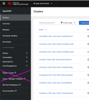
- Remove support cases, and cluster manager feedback from side nav
- Work for documentation to become learning resources.
- The overview page should be called the dashboard.
- pkreuser & tle@redhat.com working on a new overview page. Maybe like app+data services style?
Update (12/12/22):
This story originally captured more of a wholistic OCM nav IA redesign that would be affected by an OCM overview page and also potential OpenShift product pages (PD-1425). Since that work is still in flight and may be so for a while longer, this story now captures more immediate-term "quick wins" we can make with the OCM nav, namely:
- Remove Support Cases (you can open a support case from the help)
- Remove Openshift manager feedback (there is a purple feedback tab available)
- relates to
-
RHCLOUD-24988 Remove 'Support Cases' and 'Cluster Manager Feedback' links from the OCM left nav
-
- Closed
-
-
PD-1425 OpenShift bundle (OCM) "overview" or "landing" page
-
- Closed
-
-
PD-1629 OCM Overview - Day 1
-
- Closed
-
