-
Story
-
Resolution: Done
-
Major
-
None
-
None
-
5
-
False
-
False
-
None
-
HAC Infra OCM - Sprint 226
Captured from the Unboxing doc. The user interface for configuring identity providers should be re-evaluated. It is not clear that the left hand sub navigation is an actual navigation that needs to be clicked on.
Mockup of desired look:
(ignore Overview being select, Access control was intended)

PF tabs https://www.patternfly.org/v4/components/tabs#vertical =isBox
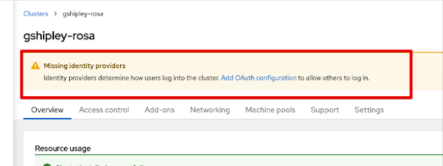
Additionally, we need to directly link users to the IdP tab when they click on that link from the info message from the cluster overview screen (if gets complex will be split into separate card)
UPDATE: "Add OAuth configuration" link on top of cluster details already does link to "Access control" tab by appending `#accessControl` hash to cluster details page url.


