-
Story
-
Resolution: Done
-
Major
-
None
-
False
-
-
False
-
Admin Sprint 226
Background
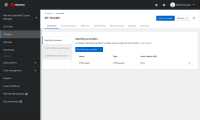
Captured from the Unboxing doc. The user interface for configuring identity providers should be re-evaluated. It is not clear that the left hand sub navigation is an actual navigation that needs to be clicked on.
Goal
Make it clear that the sub navigation is clickable and link users to the IdP tab when they click on that link from the info message from the cluster overview screen.
- relates to
-
HAC-2267 UX improvements for the Access Control tab on the cluster details page
-
- Closed
-
