-
Story
-
Resolution: Unresolved
-
 Undefined
-
None
-
6.19.0
-
None
-
False
-
sat-artemis
-
None
-
None
-
None
-
None
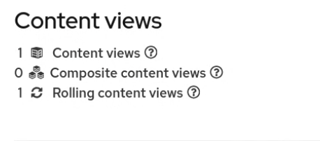
Content view landing page{}
Alignment:
Top part numbers - icons - text should be left-aligned. See PF5 guidelines
It would be nice if the numbers were links filtering the table. (Nice to have)

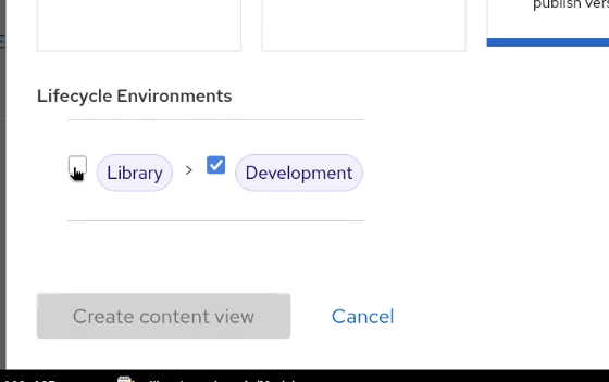
CV create modal
Checkbox vs. radio
If users can select only one environment, a radio button should be used instead of a checkbox.
Alignement
1. A checkbox or a radio should be centered with a caret and a label.
2. No need to have lifecycle environment component indented. Align it left with the rest of the modal content.
Labels
Compact labels should be used
Capitalisation
"Lifecycle environments" should be sentence case
Extra horizontal line
Remove the extra line between the title "Lifecycle environments" and the env. component.