-
Bug
-
Resolution: Won't Do
-
Minor
-
None
-
None
-
None
-
False
-
-
False
-
-
Description of problem:
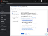
From ROSA Wizard > Accounts and roles section, when user clicks the "Associated AWS accounts" drop-down,
- Refresh button adjacent to "Associate AWS accounts" dropdown misplaces.
- "Associate AWS accounts" drop-down list overlapped with refresh button.(probably due to the previous issue).
- "Associate AWS accounts" drop-down list widget seems partially cut at the bottom even if the respective scrollbar moved to the bottom the UI effect is the same.
Important Note: This happens when the "Associate AWS accounts" list is empty.
How reproducible:
Always
Steps to Reproduce:
- Launch OCM staging env.
- Go to ROSA wizard > Accounts and roles section.
- Click on "Associate AWS accounts" dropdown.
- View the behavior.
Actual results:
- Refresh button adjacent to "Associate AWS accounts" drop-down misplaces.
- "Associate AWS accounts" drop-down list overlapped with refresh button.(probably due to the previous issue).
- "Associate AWS accounts" drop-down list widget seems partially cut at the bottom even if the respective scrollbar moved to the bottom the UI effect is the same.
Expected results:
- Refresh button adjacent to the "Associate AWS accounts" dropdown should always be placed in the original position.
- "Associate AWS accounts" drop-down list should not overlap with the refresh button.
- "Associate AWS accounts" drop-down list widget should be clearly visible i.e. including bottom borders ( if scrollbar enabled then after moving scrollbar from top to bottom).
Additional info:
Please find the attached screenshare.
- is related to
-
HAC-2396 [ROSA Wizard] New ROSA “getting started” page
-
- Closed
-

