-
Bug
-
Resolution: Done
-
 Normal
-
None
-
None
-
None
-
False
-
-
False
-
-
-
OCM UI Sprint 245, OCM UI Sprint 246, OCM UI Sprint 247, OCM UI Core Sprint 248, OCM Core Sprint 249, OCM Core Sprint 250
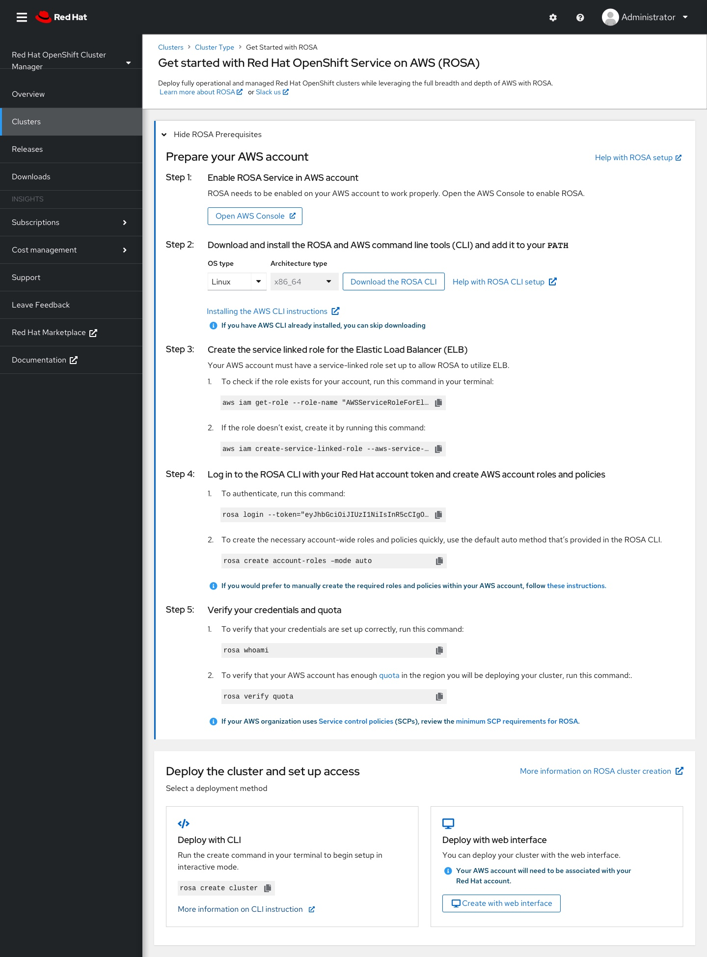
Description of problem:
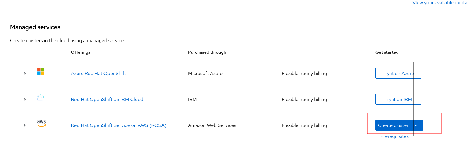
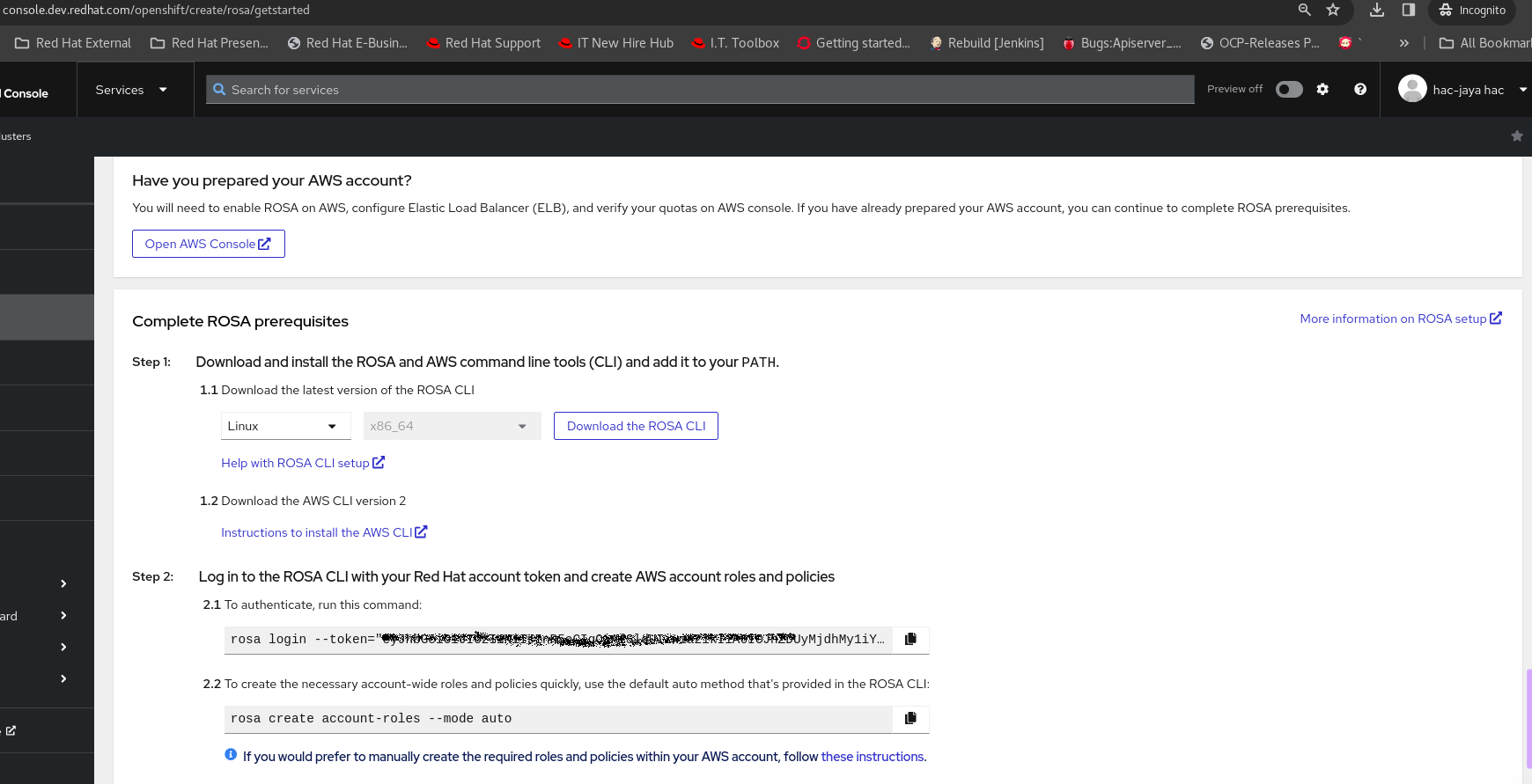
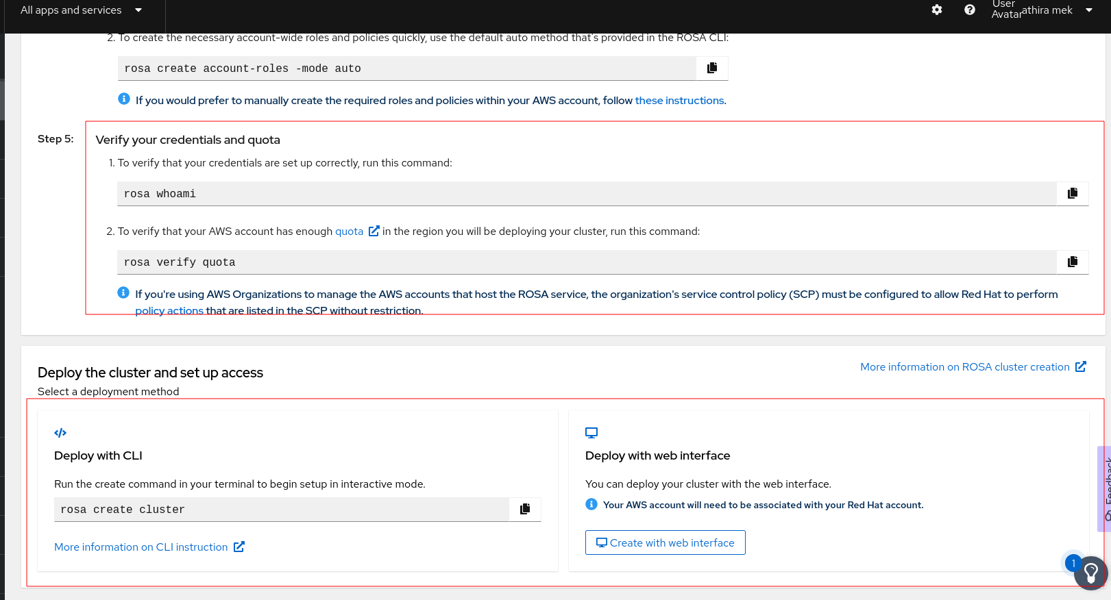
1. Size irregularity on command fields from ROSA getstarted page(Under ROSA Prerequisites steps_.
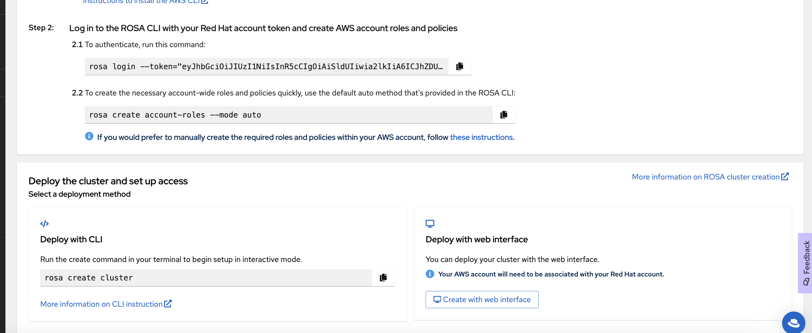
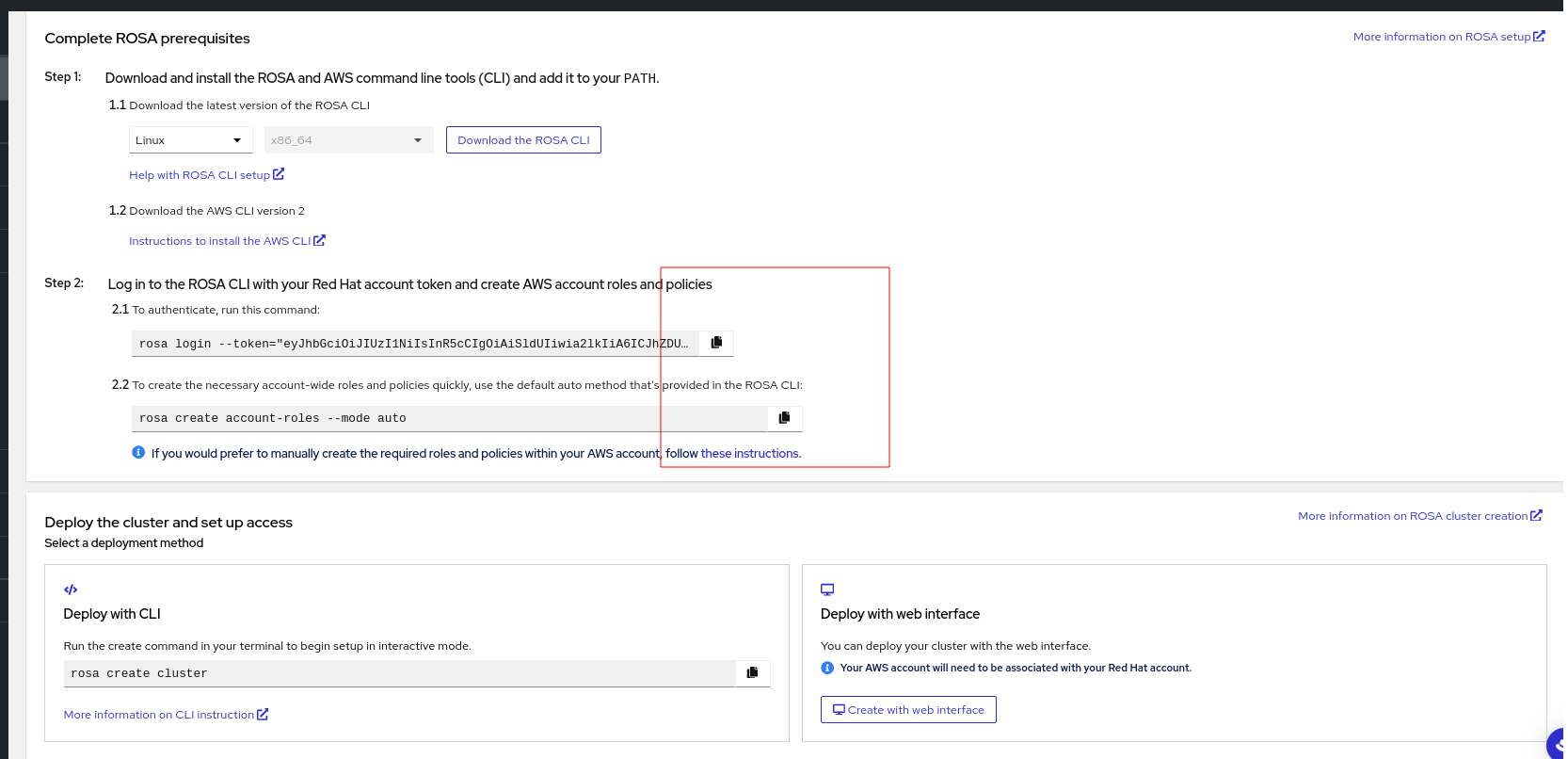
- Step 3 - Create the service linked role for the Elastic Load Balancer (ELB) :
The two commands listed in the page are relatively larger and occupied in a smaller command field. - Step 4 - Log in to the ROSA CLI with your Red Hat account token and create AWS account roles and policies :
The two command field sizes are irregular and the account-role command field seems larger. It would be nice if these command fields maintain the same length. - Step 5 - Verify your credentials and quota :
The two commands field sizes are larger and which is not a great design while considering look and feel.
In General , if we could maintain the similar size for all the command line fields , it would really look better.
2. Deploy the cluster and set up access
The two deployment method cards (Deploy with CLI and Deploy with web interface) could be visualized as separate cards with solid borders would give a nice feel.
With the current design, it is not showcased as two different cards for the user (could be due to a very thin card border and looks plain area) from the UI.
How reproducible:
Always
Steps to Reproduce:
Launch OCM staging env.
Go to ROSA getstarted page (page location - /openshift/create/rosa/getstarted)
Verify the UI elements and its presentations.
Actual results:
See the description.
Expected results:
1. Regarding Size irregularity for command fields, Keep standard size for all the command fields from the getstarted page.
2. Regarding the deployment method cards, seperate cards with solid borders for better feel on UI for users.
Additional info:
Please find the attached screenshot.


- is related to
-
HAC-2396 [ROSA Wizard] New ROSA “getting started” page
-

- Closed
-
- mentioned on