-
Bug
-
Resolution: Done
-
Major
-
None
-
None
-
Quality / Stability / Reliability
-
False
-
-
False
-
-
-
OCMUI Core Sprint 255, OCMUI Core Sprint 256, OCMUI Core Sprint 257, OCMUI Core Sprint 258, OCMUI Core Sprint 259, OCMUI Core Sprint 260, OCMUI Core Sprint 261, OCMUI Core Sprint 262, OCMUI Core Sprint 263, OCMUI Core Sprint 264, OCMUI Core Sprint 265, OCMUI Core Sprint 266
Description of problem:
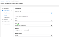
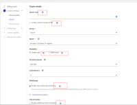
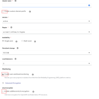
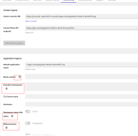
In OCM UI staging, there were seen styling issues i.e misplaced UI elements in different part of OCMUI. The issues mainly seen with wizard steps and cluster details tabs.
Some of the examples as below
1. Wizard : The gaps between the help ![]() icon and widget seems more
icon and widget seems more
2. Wizard : The help ![]() icons are placed not in same position as related widget.
icons are placed not in same position as related widget.

3. Wizard : Position of checkbox and associated text definition alignment seems wrong
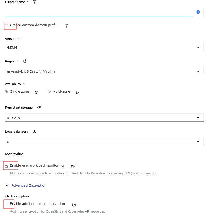
4. Cluster details page (ex: Networking tab)
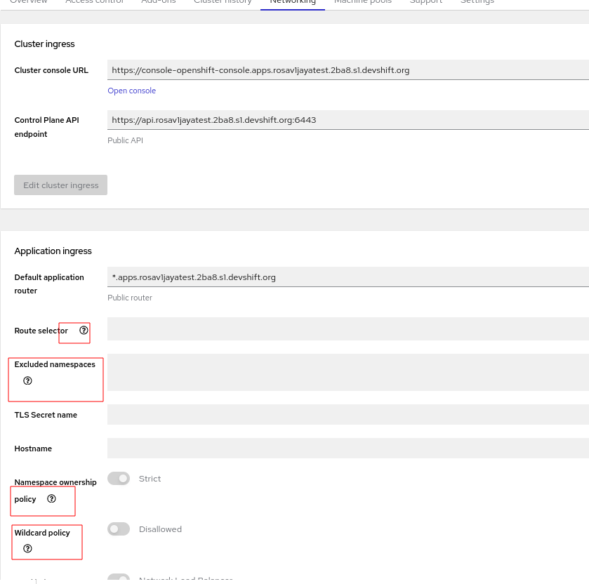
How reproducible:
Always
Steps to Reproduce:
- Open OCM UI staging.
- Launch OSD or ROSA wizard
- Observe the widget styles and placement in each section.
- Open cluster details and review each tab definitions.
- relates to
-
OCMUI-1821 [Machine pool] Misplaced "Maximum node count" field from "Add machine pool" dialog.
-
- Closed
-
- mentioned on
