-
Bug
-
Resolution: Done
-
Normal
-
None
-
None
-
False
-
-
False
-
-
-
OCMUI Core Sprint 254
Description of problem:
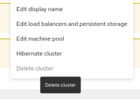
Tooltip for "Delete cluster" option is different in cluster detail compared to cluster list
The same goes for other Actions in this menu on the Cluster Details page
How reproducible:
always
Steps to Reproduce:
- Launch OCM UI staging
- Create cluster
- Navigate to cluster detail page
- Enable deletion protection
- Check Actions menu top right and check tooltip for "Delete cluster" option
- Navigate to cluster list and check "Delete cluster" option menu there
- Observe different tooltip texts
Actual results:
Tooltip for cluster detail page is same as when deletion protection is disabled and tooltip from cluster list is correct, meaning it shows information to user about deletion protection being enabled
Expected results:
Both tooltips should inform user about deletion protection being enabled
- impacts account
-
OCMUI-1389 Expose cluster delete protection
-
- Closed
-
- mentioned on

