-
Bug
-
Resolution: Duplicate
-
Normal
-
None
-
None
-
None
-
Quality / Stability / Reliability
-
False
-
-
None
-
Moderate
-
None
-
None
-
None
-
None
-
None
-
None
Here is a list of various usability issues with the Histogram feature. Some of these might just need clarity on what it did and how it is suppose to behave.
Go to Observe > Network Traffic. Click "Show histogram".
1. It seems non-intuitive that clicking "Show histogram" 'and "Hide histogram" would update the flow table.
2. It is not obvious that "<<" and ">>" updates the Time range.
3. It seems non-intuitive that "<" and ">" does not update the Time range, but "<<" and ">>" does.
4. It takes between 1 to 8 seconds to update the flow table which leads to some confusion until you realize this, despite the spinning refresh icon. For example:
a) Click "Show histogram". After a few seconds, the table gets updated.
b) Click "<". Nothing happens and then a few seconds later, the table is updated.
c) Click "<<". The Time range is immediately updated (if you notice), but it takes a few seconds before the table is updated.
5. The query limit is set to 50 (default) in #4. If this is set to 500 or 1000, it is not very usable.
6. It seems natural to want to click on a blue bar and have it go there, but that doesn't work.
7. Click "<". Wait until it's done. Click "<<". The selected bar in gray is missing.
8. The meaning of "<<" and ">>" goes back 5 seconds or goes forward 5 seconds. When you click "<<", it's not obvious what happened because the selected bar in gray doesn't move and only the x-axis times go back 5 seconds. It would be nice if it provided some horizontal scrolling animation to show it moving back 5 seconds. Do the same, but moving forward for ">>".
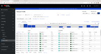
9. The x-axis time should not have a leading 0 for the hour such as "01:01" (see histogram.png), given that it's using AM/PM (and not a 24-hour clock).
10. It's not clear what the y-axis unit of measure is (see histogram.png).
- is duplicated by
-
NETOBSERV-919 Histogram user experience feedback
-
- Closed
-
