-
Bug
-
Resolution: Done
-
Minor
-
None
-
None
-
None
-
Quality / Stability / Reliability
-
False
-
-
None
-
None
-
None
-
None
-
None
-
None
-
None
-
None
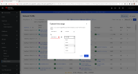
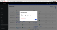
In Observe > Network Traffic, in the upper right corner, change "Last 5 minutes" to "Custom time range". The "Custom time range" dialog comes up.
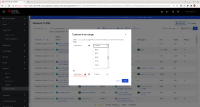
If you select the dropdown for the From time or the To time, the dialog gets bigger to make room for the choicelist, the other fields in the dialog move down, and then it re-centers the entire dialog, creating a jarring effect. If you select a choice, the dialog returns back to normal and re-centers again, creating a similar jarring effect the other way. See attachments.
This behavior is unusual. In a typical UI, the dropdown choicelist does not change the dialog or screen size. It also does not shift other components down in the dialog as it simply overlays the components and even extends beyond the dialog if necessary.
- relates to
-
NETOBSERV-586 Console plugin dependencies update
-
- Closed
-


