-
Story
-
Resolution: Done
-
Undefined
-
None
-
None
-
None
-
Future Sustainability
-
False
-
-
False
-
None
-
None
-
None
-
NetObserv - Sprint 242, NetObserv - Sprint 243, NetObserv - Sprint 244, NetObserv - Sprint 245
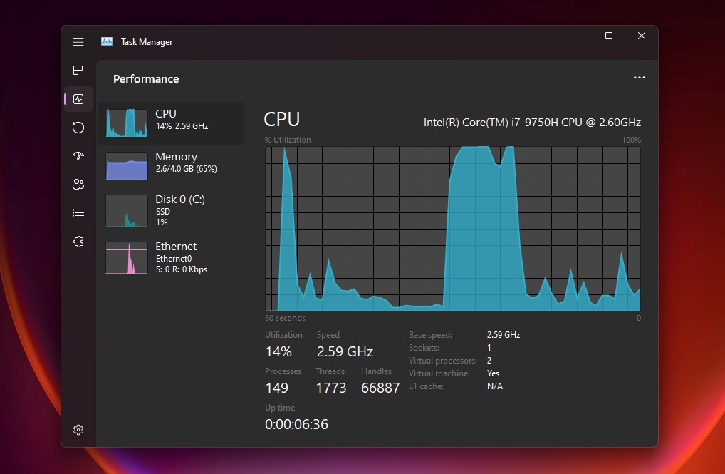
The Windows Task Manager layout seems to be a good match for our overview section

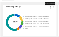
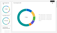
We should add an option to be able to switch between current display and a simplified list of graph, with a selection displayed as full screen on the right.
It will help to focus more on a specific data and would solve all the truncate issues we have with legends.
Also, this seems to be a good to have for bigger charts such as sankey.
- blocks
-
NETOBSERV-1382 DSCP graphs
-
- Closed
-
-
NETOBSERV-1393 Add a guiding tour for Overview tab
-
- Closed
-
- links to
- mentioned on

