Uploaded image for project: 'Kogito'
  1. Kogito
  2. KOGITO-5243

Stunner - Improve resize hint for nodes

XMLWordPrintable

    • Icon: Enhancement Enhancement
    • Resolution: Unresolved
    • Icon: Minor Minor
    • Kogito Tooling Future
    • Kogito Tooling 0.9.1
    • None

      Currently the resize hint for nodes is a red dot at the bottom left, which may not be very clear to the user what it means.

      Maybe we should improve the resize hint to use something more clear to the user, like some arrows at each side that is visible when cursor is hover a node. Something like this:
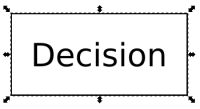
      Or a more clear hint like this one:
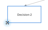
      In the example above, the blur effect could be visible when mouse is hover the arrows.

        1. 3770defa9baee8eb8e9af84ebefd373f.png
          27 kB
          Guilherme Gomes
        2. RESIZE.png
          7 kB
          Daniel José dos Santos
        3. screen_shot_2018-12-13_at_9.09.24_am.png
          19 kB
          Daniel José dos Santos

              kverlaen@redhat.com Kris Verlaenen
              dadossan Daniel José dos Santos (Inactive)
              Votes:
              0 Vote for this issue
              Watchers:
              4 Start watching this issue

                Created:
                Updated: