-
Enhancement
-
Resolution: Done
-
Critical
-
4.4.0.Alpha1
-
devex #114 May 2016
-
1
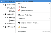
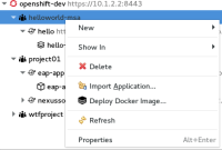
It would be nice if we would have context menus of OpenShift elements in OpenShift Explorer view a bit reorganized, because at the moment some of them seems to be for me a bit messy (as least context menu of a service).
See screenshots of context menus:
connection
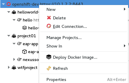
project

service
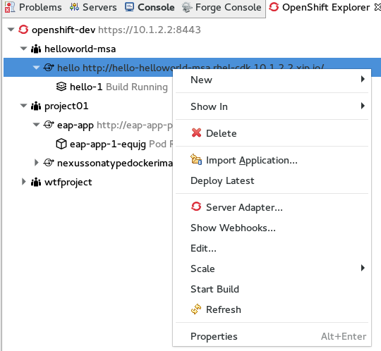
pod
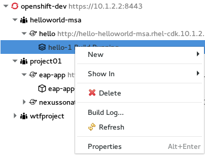
Here is the guideline how should context menus look like
https://wiki.eclipse.org/User_Interface_Guidelines#Context_Menus_2
- is duplicated by
-
JBIDE-20506 Reorganize context menu items of a OpenShift v3 connection
-
- Closed
-
- relates to
-
JBIDE-22247 Reorganize context menus of OpenShift Resources in properties view
-
- Closed
-
