-
Feature
-
Resolution: Done
-
Major
-
None
-
fuse-7.4-GA
There are a few issues on this page.
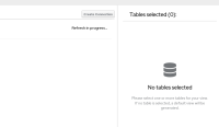
1. Missing filter toolbar, which will be addressed in ENTEST-12892.
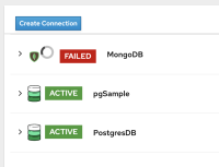
2. There are two primary buttons on this page - Create connection, Next. In general, it's recommended to have only one primary button on a given page. The location of the Create connection button could be misleading to users and be mistaken as a step of the flow. My suggestion is to have create connection as a secondary button and move it to the top right of the card so it's not interfering the main workflow.
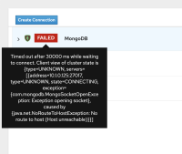
3. A tooltip is opened when hover over the Failed (red) label. Consider displaying an error message for this since user may need to reference the content in the tooltip to investigate further.
4. If the connection is not available (Failed), consider disabling the expand control as there will be no content in the expanded view. See screenshot below.
5. Need to reconsider the spinner icon location and if we can provide more information to user in terms of why there's a spinner icon. With the current implementation, the spinner icon pushes content to the right. See screenshot below.
6. The empty state content needs to be updated. It should say "No tables selected".
7. The list on the left is using PF3 list view while the one (table selected) on the right is using PF4 data list component. Should change the one on the left to use PF4 data list.
Latest design is here https://marvelapp.com/d2f35bh/screen/63596031
- relates to
-
ENTESB-12953 UX Design - DV create a view error message
-
- Closed
-


