Uploaded image for project: 'WINDUP - Red Hat Application Migration Toolkit'
  1. WINDUP - Red Hat Application Migration Toolkit
  2. WINDUP-745

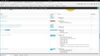
We should not display the "Warnings" header if there is only one classification or hint

XMLWordPrintable

    • Icon: Bug Bug
    • Resolution: Done
    • Icon: Minor Minor
    • 2.4.0.CR2
    • 2.3.0.Final, 2.4.0.CR1
    • None
    • None
    • None

      Right now, we use a lot of vertical space in the application overview page where it is not really necessary.

              mnovotny@redhat.com Marek Novotny
              jsightle@redhat.com Jess Sightler
              Votes:
              0 Vote for this issue
              Watchers:
              2 Start watching this issue

                Created:
                Updated:
                Resolved: