Uploaded image for project: 'WINDUP - Red Hat Application Migration Toolkit'
  1. WINDUP - Red Hat Application Migration Toolkit
  2. WINDUP-3074

MTA - improve labels for migration paths

XMLWordPrintable

    • Icon: Story Story
    • Resolution: Unresolved
    • Icon: Undefined Undefined
    • None
    • 5.1.3.Final
    • None
    • False
    • False
    • Hide
      * *Why we missed the bug?*
       ** Pick to proper answer from drop-down field upper.
       +_Additional comments:_+


       * *What is required:*
       ** Pick to proper answer from drop-down field upper.
       +_Additional comments:_+
      Show
      * *Why we missed the bug?*  ** Pick to proper answer from drop-down field upper.  +_Additional comments:_+  * *What is required:*  ** Pick to proper answer from drop-down field upper.  +_Additional comments:_+
    • Undefined
    • ---
    • ---
    • None

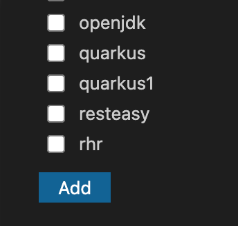
      As tested in Code Ready Workspaces, migration paths appear with the option name as in the screenshot attached. 

      It is not easy to understand what each one of them means.

      Please consider adding a "human readable" name to each one of them in order to improve usability. Examples:

      • quarkus1 --> quarkus 1.x updates
      • rhr --> red hat runtimes for openshift
       

              Unassigned Unassigned
              mperezco@redhat.com Miguel Perez Colino (Inactive)
              Votes:
              0 Vote for this issue
              Watchers:
              1 Start watching this issue

                Created:
                Updated: