-
Story
-
Resolution: Done
-
 Major
Major
-
4.1.0-SNAPSHOT
-
None
-
None
-
3
-
Sprint 46
-
None
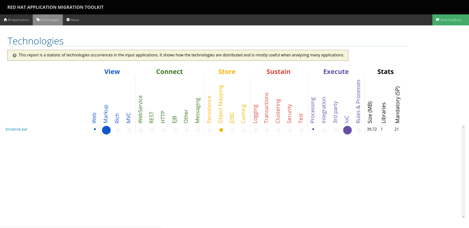
I'd like to propose a change in the freemarker templates. I think it is necessary with the newly introduced technology reports.
the space which is occupied just by the header and the description is, I think, too much. compare

and
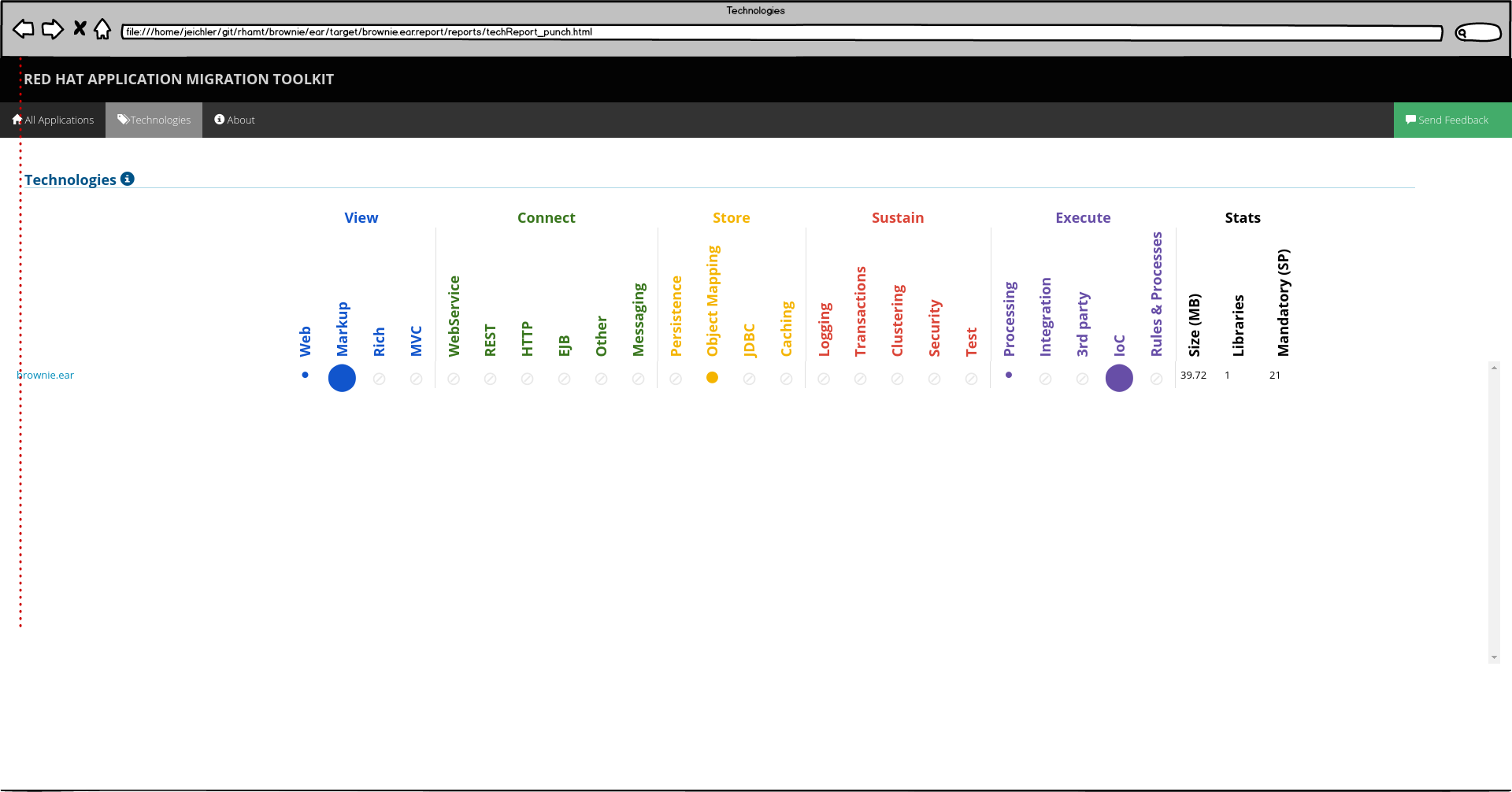 .
.
the second one is what I am proposing and there are several changes made:
- changed the font sizes to match with the font size and weight of
- either 'Red Hat Application Migration Toolkit' for headers
- or the navbar
- moved the description into an info tooltip
Point 2 (together with changing the font size and weight as described in 1.2) is what makes sense for all pages (All Applications, Dashboard, About, etc.).
While having to change the templates anyway, would it be possible to also align the content? See the dotted red line in the second screenshot.