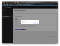
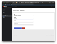
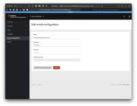
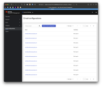
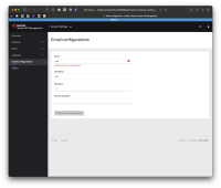
There's a basic design for the Email configuration form but we need to review and improve its design, desired UX and microcopy. See current design in attached images.
UPDATE:
Apply the changes suggested in the reviewed design: https://marvelapp.com/prototype/af12g9j/screen/85250049
- is related to
-
THREESCALE-8088 [UI Strings] Improve UX for email configuration page
-
- Closed
-
- is triggered by
-
THREESCALE-8041 (basic) UI page for email configuration
-
- Closed
-
