Uploaded image for project: 'Red Hat 3scale API Management'
  1. Red Hat 3scale API Management
  2. THREESCALE-1470

Highlights in the cms part of the developer portal should be more visible

XMLWordPrintable

    • Icon: Enhancement Enhancement
    • Resolution: Done
    • Icon: Minor Minor
    • None
    • 2.4 ER1
    • System

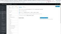
      The highlights in the CMS tool for the designing the developer portal should be more visible. Right now it's changing text color to link color, maybe text color to alert color would be enough. The idea is that peripheral vision should be able to detect the change.
        1. bgs.webm
          770 kB
        2. bgs.webm
          770 kB
        3. deepin-screen-recorder_Select area_20181119140451.gif
          deepin-screen-recorder_Select area_20181119140451.gif
          171 kB
        4. saas.png
          saas.png
          393 kB
        5. Screenshot 2018-11-09 17.21.35.png
          Screenshot 2018-11-09 17.21.35.png
          54 kB
        6. Screenshot 2018-11-09 17.21.42.png
          Screenshot 2018-11-09 17.21.42.png
          52 kB

              Unassigned Unassigned
              pstanko@redhat.com Peter Stanko (Inactive)
              Peter Stanko Peter Stanko (Inactive)
              Votes:
              0 Vote for this issue
              Watchers:
              3 Start watching this issue

                Created:
                Updated:
                Resolved: