-
Bug
-
Resolution: Unresolved
-
Minor
-
None
-
None
-
None
-
False
-
False
-
Undefined
-
-
Priority Backlog
-
None
Request for Enhancement -
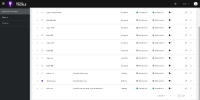
If there are many applications available in the application inventory view, then it becomes somewhat uneasy to scroll to top every time to click on Assess or Review button for selected application.
User can certainly, limit the items in table through selection of items being displayed per page, however, it will be nice to have those buttons rather in a fixed header, that does not hide them on page scroll.
