Uploaded image for project: 'Konveyor Tackle'
  1. Konveyor Tackle
  2. TACKLE-203

[TACKLE-107] - Review screen shows "Risk" where as UI mockups shows "Rank"

XMLWordPrintable

    • False
    • False
    • Undefined
    • None

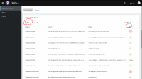
      Small difference between mockup UI and Review screen .

      *Point 11 . The Assessment Summary will allow the issues to be filtered by Rank (filtering by other criteria (Question and Answer to be defined)). *

      The Last column of review page shows "risk" where as mock ups says "Rank"
      Please clarify which one we are going to use .

      See attached screenshot.
              pcattana Philip Cattanach
              rhn-support-sshveta Shveta Sachdeva
              Votes:
              0 Vote for this issue
              Watchers:
              3 Start watching this issue

                Created:
                Updated:
                Resolved: