-
Bug
-
Resolution: Done
-
Minor
-
None
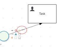
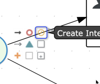
The user has 3 nodes - A, B, and C. The user connects A to B, then wants to also connect A to C. When trying to crate a new connector line from A to C, the first connector line from A to B can obscure the icons on A (see attachments).
At the very least, the z-stack order might need to be rearranged so the icons are on top of the connector lines. This way, the icons would be less obscured when existing connectors overlap them. We may also need to consider other visual treatments to keep the icons clearly visible.
Acceptance Criteria
East and South toolbox menu should have:
- White toolbox background @ 95% opacity
- No toolbox border
- Matching gray hover icon borders between the south and east toolboxes
- is incorporated by
-
KOGITO-4416 [Stunner] Connectors usability improvements
-
- Closed
-
- is related to
-
KOGITO-4977 Stunner - Texts overlap toolboxes
-
- Resolved
-

