-
Bug
-
Resolution: Unresolved
-
 Normal
-
None
-
1.6.1
-
1
-
False
-
-
False
-
Release Note Not Required
-
-
-
RHDH F&UI plugins 3286
Description of problem:
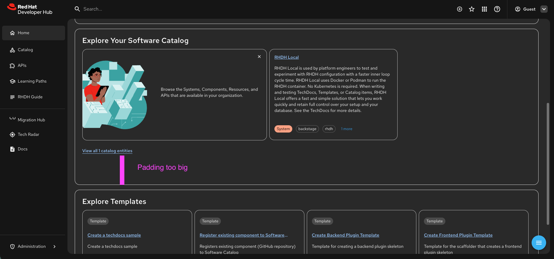
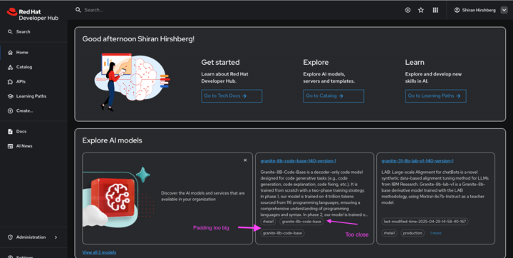
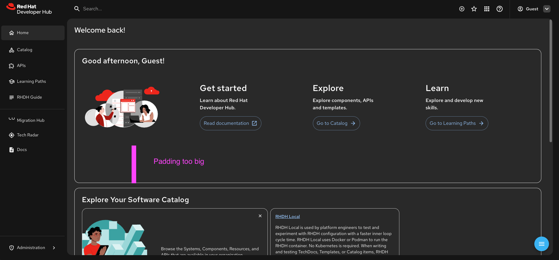
There is quite big padding next to the arrow buttons in the Welcome card (see screenshot attached)*The "Explore AI Models" text sometimes appears too close to the tags, can we adjust the spacing? (see screenshot attached)Can we make the entire card clickable for both "Explore AI Models" and "Explore AI Templates"?
- When we show the "x more" text for tags, could we make it gray to indicate it's not a button? Align it with the design.
- The vertical spacing between tag rows seems too large, can we reduce it? (see screenshot attached)
- Can we make the tags on the home page clickable, directing users to the catalog page filtered by the selected tag?
- There is a big padding below the welcome card and the "Explore Your Software Catalog" card
For dark mode, we should use a different blue for buttons and links as specified in the PatternFly guidelines. This change applies not just to the home page but across all pages. (change to dark mode here to see)