-
Bug
-
Resolution: Unresolved
-
 Minor
Minor
-
None
-
1.8.0
-
None
-
False
-
-
False
-
-
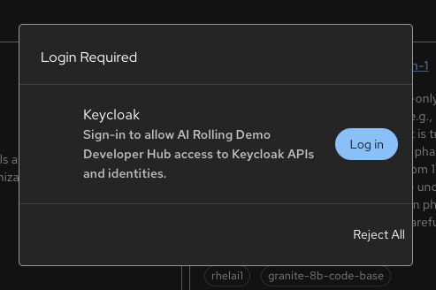
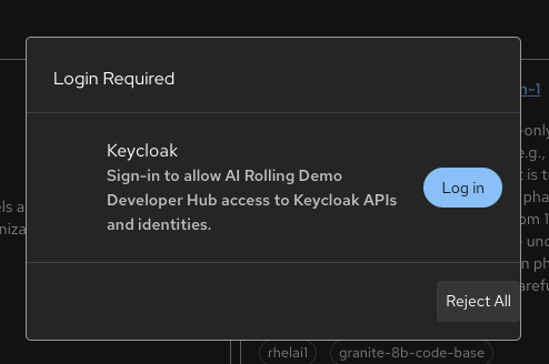
Description of problem:
If your auth token expires and you still have a session open, there's a Login Required dialog that appears, which offers a Log in button to renew in Keycloak, or a Reject All button. Log in uses a rounded button style, while the Reject All button underneath it uses a flat button with square edges if you mouse over it and it lights up.
Should we be more consistent with our button styles on this dialog?
Prerequisites (if any, like setup, operators/versions):
Steps to Reproduce
Log in and wait for token to expire
Actual results:
Dialog that appears after token expiration mixes button styles
Expected results:
Button styles to be consistent. Should the padding be more similar as well, or are they supposed to be offset, with one right up against the edge of the dialog?
Reproducibility (Always/Intermittent/Only Once):
Build Details:
Rolling demo env