-
Bug
-
Resolution: Unresolved
-
 Major
Major
-
None
-
1.7.0
-
1
-
False
-
-
False
-
Release Note Not Required
-
-
-
RHDH F&UI plugins 3287, RHDH F&UI plugins 3288
Description of problem:
Prerequisites (if any, like setup, operators/versions):
Steps to Reproduce
# <steps>
Actual results:
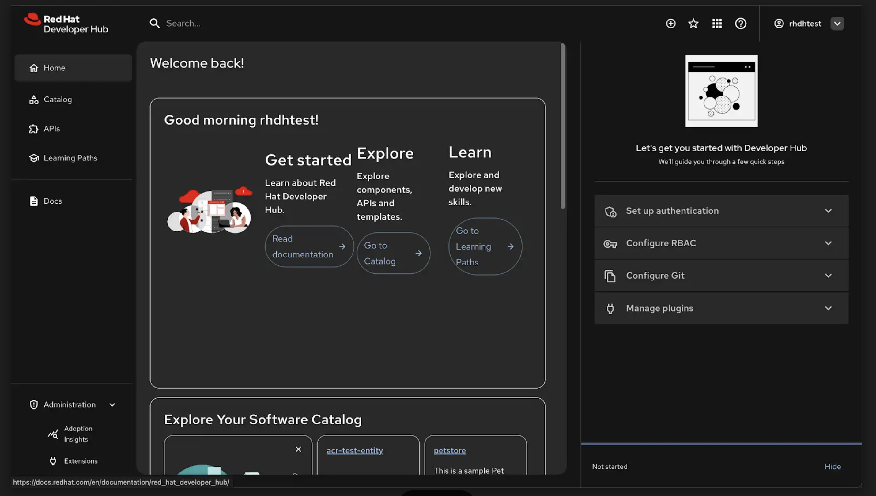
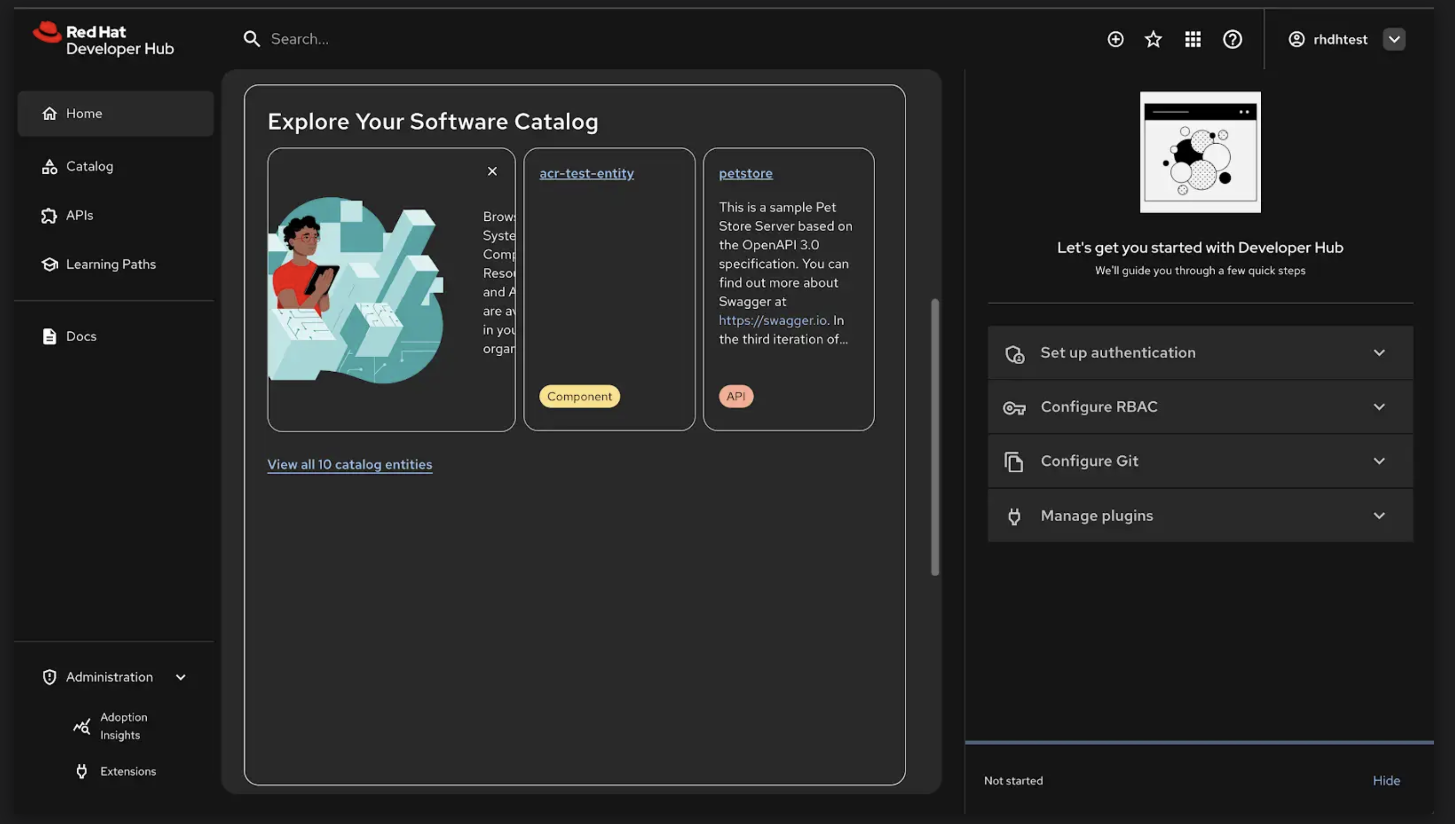
Text in cards and buttons are a little crowded when on a smaller screen
- The three sections on the first card("Getting Started") along with the buttons have crowded text.
- The first sub card of the the Explore your software catalog card has text that is partially hidden beucase of the large image that is there.
- See the screenshots for a better explanation.
Expected results:
Reproducibility (Always/Intermittent/Only Once):
Build Details:
Additional info (Such as Logs, Screenshots, etc):
- clones
-
-

- Backlog
-
- duplicates
-
-

- Closed
-
- is cloned by
-
-
- Backlog
-
-
-

- Closed
-
- is duplicated by
-
-
- Closed
-
- links to
