-
Bug
-
Resolution: Done
-
 Normal
-
1.5.0, 1.5.1, 1.6.0
-
1
-
False
-
-
False
-
Release Note Not Required
-
-
-
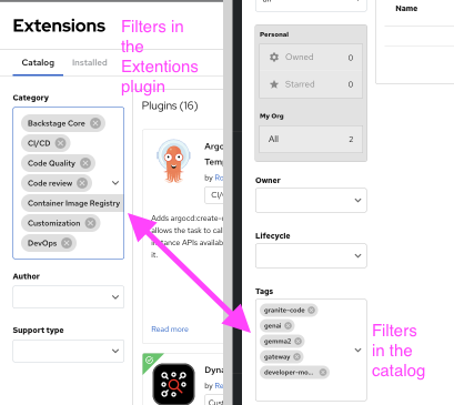
RHDH F&UI plugins 3275, RHDH F&UI plugins 3276, RHDH F&UI plugins 3277
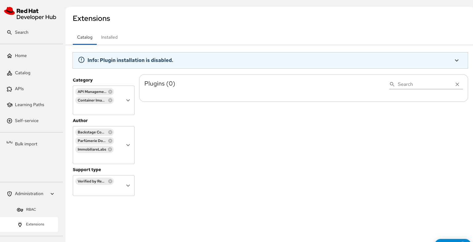
Main page improvements:
- Can we add icons to the "Catalog" and "Installed" tabs? (Figma)
- Can the "Installed" be "Installed plugins" and add the number of items next it?
- When a search returns no results, can we display a message like the one shown here?
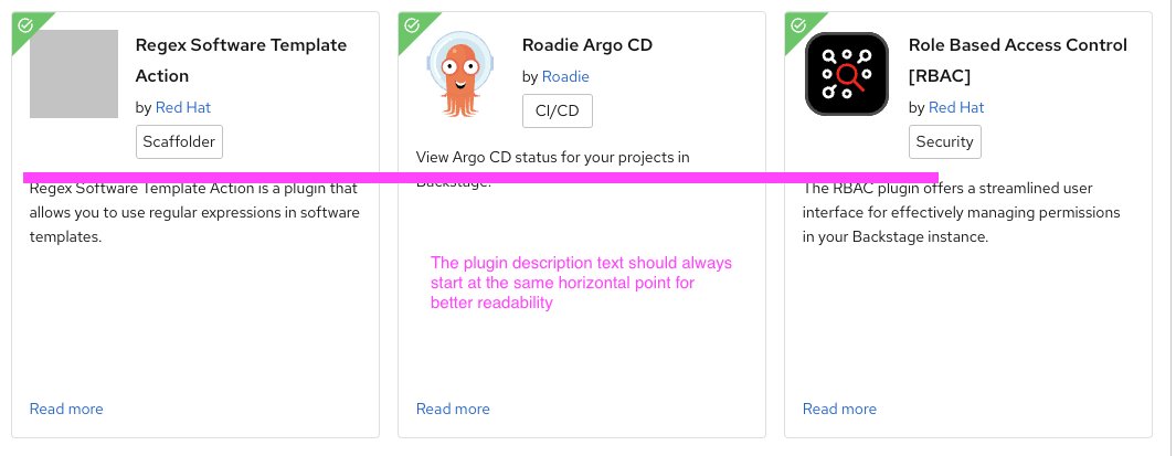
Card improvements:
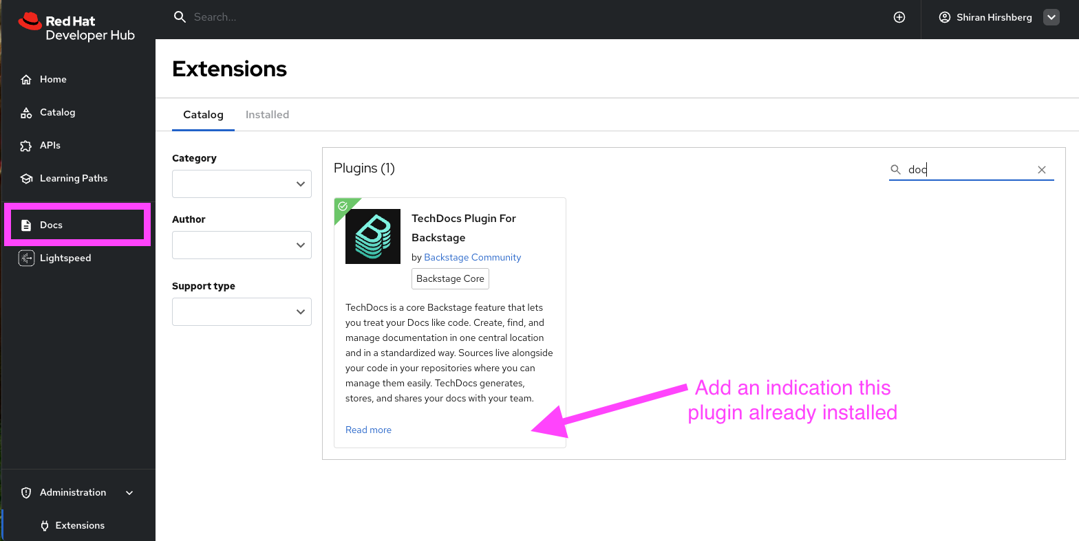
- If a plugin is already installed, we should show an indication on the plugin card (Figma)
- The hover interaction on category labels is great, it filters the list. Could we also show a visual cue when hovering over a tag, in line with PF guidelines?
- The text size in the filter tags is currently 14px, but we use 12px in the catalog. Can we align that and use the smaller size for the Extension plugin as well?
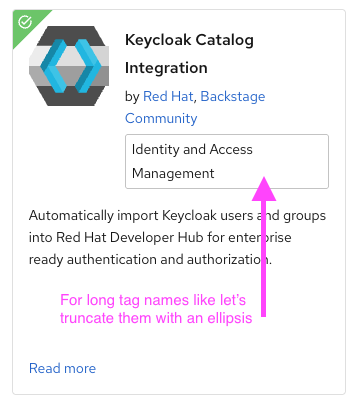
- For long tag names like "Identity and Access Management," let’s truncate them with an ellipsis (e.g., "Identity and Access...") to keep them to one line on the card (Figma)
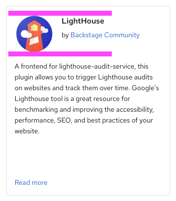
- If there’s no tag on a plugin card, we should align the icon and text properly to maintain consistency
- The plugin description text should always start at the same horizontal point for better readability
Side drawer improvements:
- The verified and certified icons should be smaller (Figma)
- The "Highlight" section needs padding, bullet points, and more spacing between the button and text
- The "About" section title should use medium-weight text and have padding below it
- The "Links" title should follow the same style as the "About" title
- Let’s reduce the size of the icons next to Links section and use bullet points
