-
Bug
-
Resolution: Done
-
 Normal
-
None
-
None
-
None
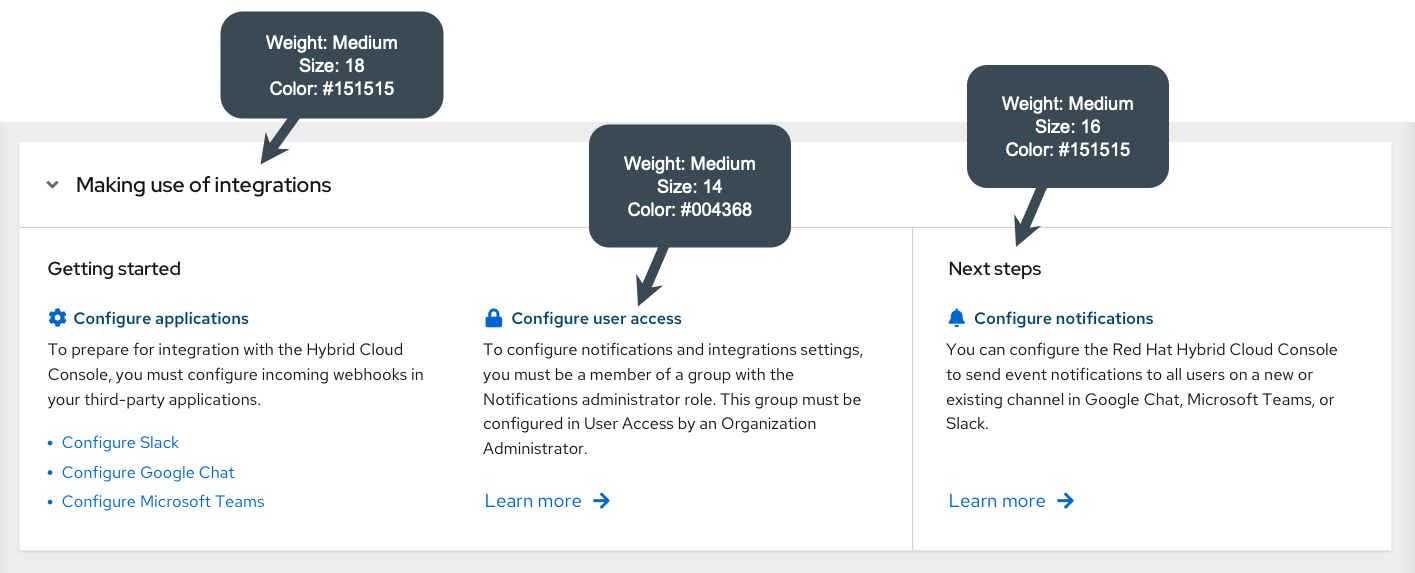
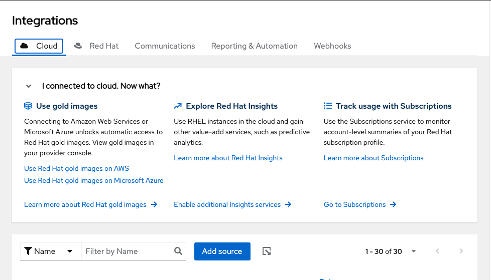
Within https://console.redhat.com/settings/integrations/ if I am on the "Cloud" tab, the headers of each section are a dark blue & the text / links are a smaller text.
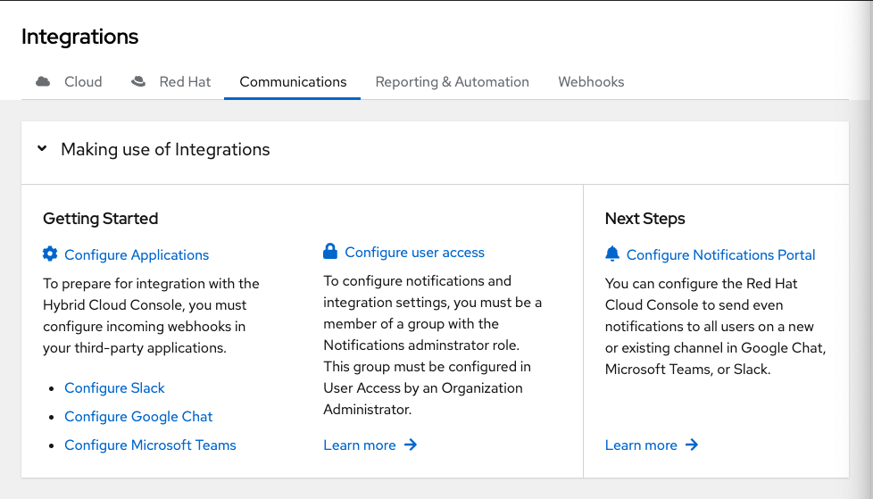
When I then click on the "Communications", "Reporting & Automation" or "Webhooks" pages, the headers look different, some of them are a bright blue which looks like a clickable link but are not, and the text below is bigger. The collapsible section portion "I connected to cloud. Now What?" and "Making use of Integrations" are different sizes and maybe even different fonts?
Minimally we should address the headers which look like links but are not to avoid confusion for our users, but there may be some visual consistency we want to implement here