-
Bug
-
Resolution: Won't Do
-
Normal
-
None
-
None
-
None
-
False
-
-
False
-
None
-
Unset
-
No
-
-
-
Plat-Ex UI Sprint 8, PlatEx UI Sprint 8, PlatEx UI Sprint 9, PlatEx UI Sprint 10
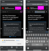
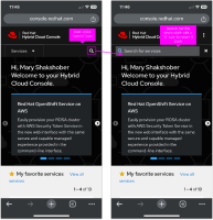
On small screen widths, the search bar condenses down to a the search icon and then turns into a search bar when clicked. However, what is currently implemented in prod is not particularly usable because the search bar only takes up a little bit of room. Instead, we should have the search bar span full-width when clicked so and have it take over the dropdown since the user wouldn't be able to use these at the same time anyway.
See the mocks below for more detail.
- clones
-
RHCLOUD-29652 Mobile navigation not behaving as expected
-
- Closed
-

