-
Bug
-
Resolution: Won't Do
-
 Normal
-
None
-
None
-
None
-
False
-
-
False
-
None
-
Unset
-
No
-
-
In prod right now, the services dropdown experience is not intuitive. The user has to do several unnecessary interactions with the expand/collapse icons. Additionally, the 'X' icon is in a location that does not make sense to close the entire services nav dropdown. So, we need these items changed/added:
- Change location of 'X' icon from the white section to next to the all services button with a vertical splitter between the blue button and the 'X'.
- Change the text logic for what is next to the expand/collapse from NAV-CATEGORY to be Category: NAV-CATEGORY
- Upon opening the services dropdown, the category expandable section should default to being expanded so that the user can see all the categories, but with 'Favorites' in the selected state.
- MOST IMPORTANT!! When a user clicks into a nav category (like AI/ML in the example), the expandable section should automatically close to reveal that category's content.
See the mocks below for more detail.
What's in prod: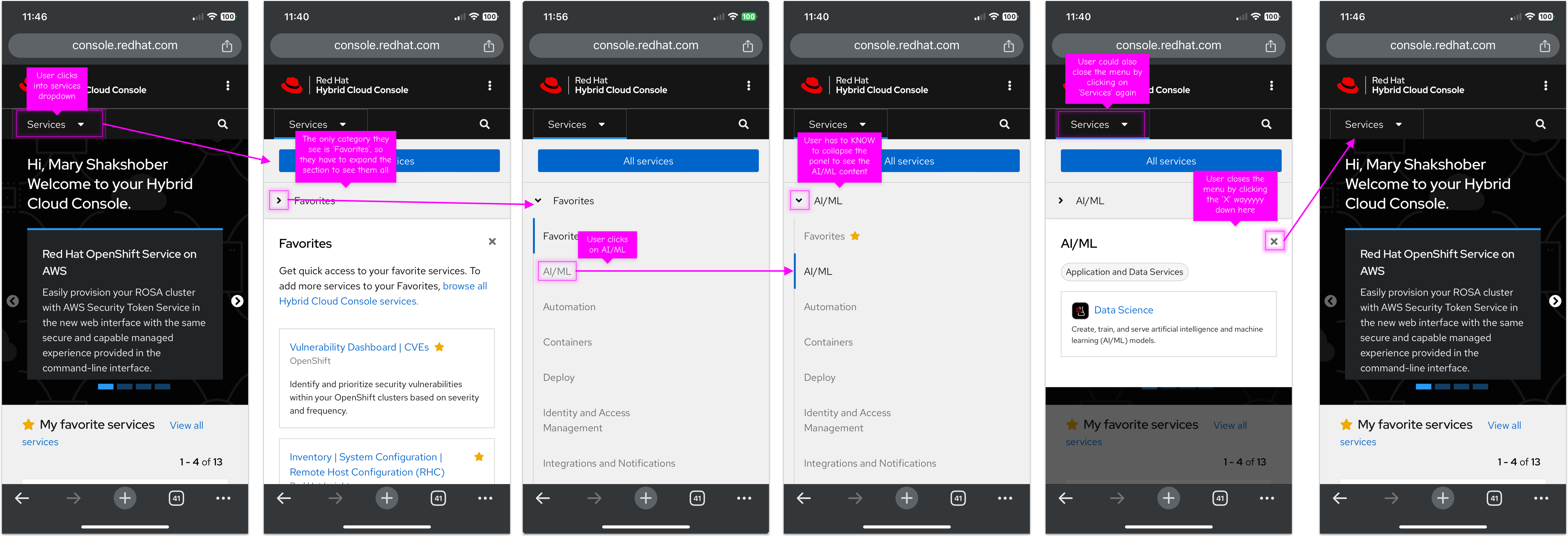
What we want: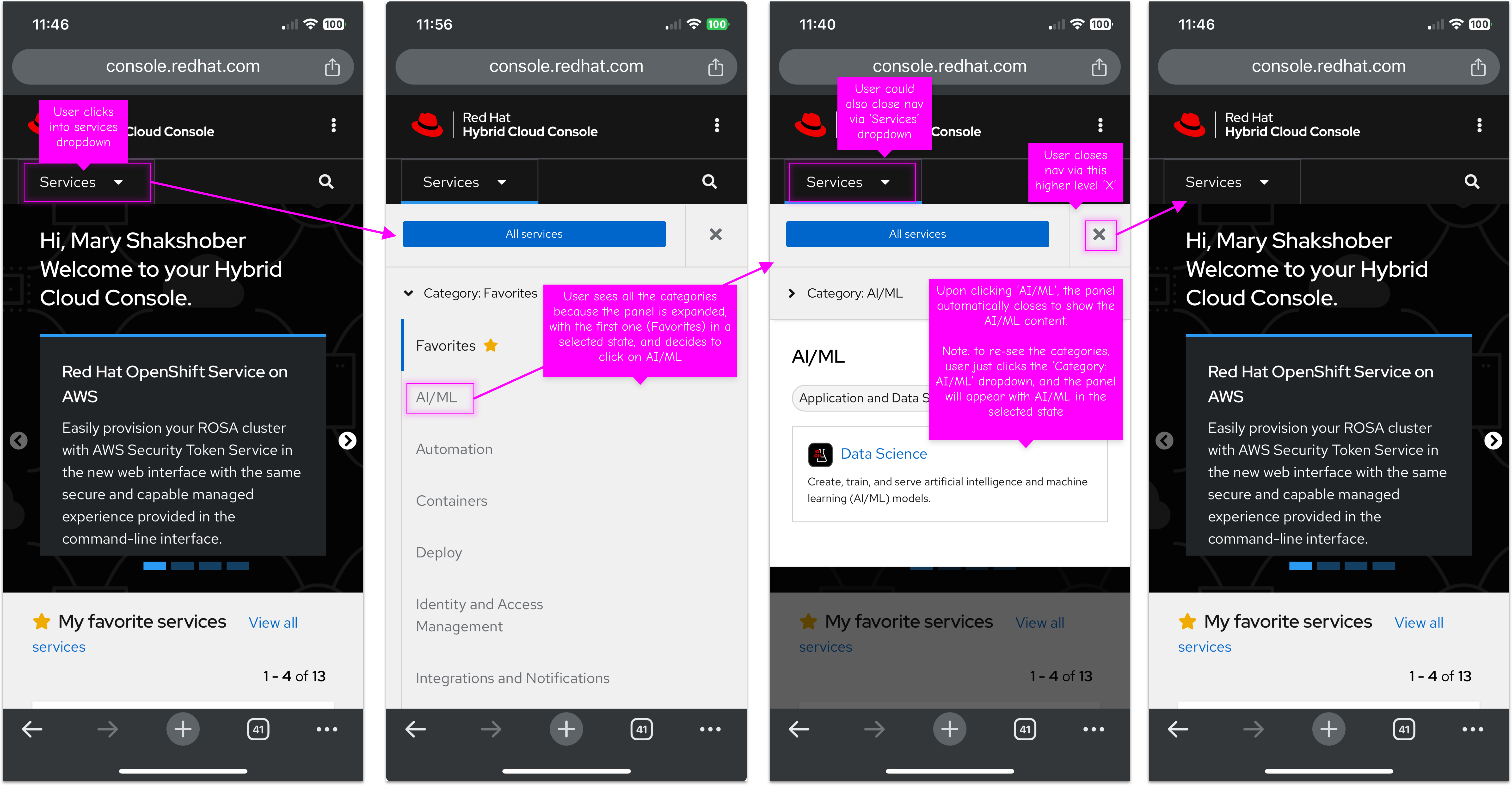
- is cloned by
-
-
- Closed
-