-
Bug
-
Resolution: Obsolete
-
Minor
-
None
-
6.3.1.GA
-
None
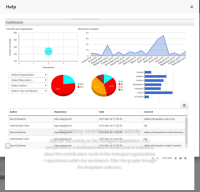
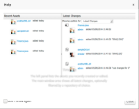
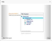
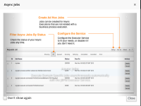
"Don't show again" text and Close button don't respect the overall layout of the Help content. In some places they are partially hidden by the picture (Timeline, People, ...), in some places they are transparent and overlapping the picture (Project authoring , Administration...) or they are too close to the picture (Jobs...). In the Contributors perspective, the layout is completely broken, and we can see only the "box" from the checkbox.


