-
Enhancement
-
Resolution: Done
-
Critical
-
6.0.0
Description of problem:
At a small screen resolutions, the data modeler is unusable because buttons disappear off-screen and can not be accessed to add data objects.
Also, create buttons are at the bottom and quite often are off-screen (even for reasonable screen resolutions) and the user has to scroll to find them. These should be moved so that users can start with these actions more readily.
Version-Release number of selected component (if applicable):
6.0.0.ER2
How reproducible:
When the browser is less than 1073px wide, the create button is not viewable on the screen of the data modeler w/ the project explorer open. Users would not realize this even exists.
Vertically, when the browser is less than 730px high, the user does not see the actions or buttons at the bottom to create and add new items to each column.
Expected results:
The middle column for data fields should not be able to be reduced in size horizontally so much that the button disappears from view, or, the button should wrap to a new line when the screen size is reduced this far.
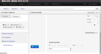
I have included a screenshot for how we might consider moving the two creation actions (Create object, Create new field) to the top of the page so that these are not off screen for most users.
- blocks
-
RHBPMS-635 Tracking bz for user experience session
-
- Closed
-
- is related to
-
RHBPMS-1379 Modification suggested to use the uberfire navigation toolbar for objects selection
-
- Verified
-
-
RHBRMS-1390 Business-central does not scale
-
- Closed
-
- relates to
-
RHBPMS-1379 Modification suggested to use the uberfire navigation toolbar for objects selection
-
- Verified
-
-
RHBRMS-1390 Business-central does not scale
-
- Closed
-

