-
Enhancement
-
Resolution: Done
-
Optional
-
None
-
None
-
2018 Week 33-35
-
5
-
NEW
-
NEW
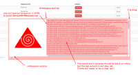
I am not to keen on the current dialog style that we have. It doesn't fit in the overall twitter bootstrap style.
Do the follow 2 tasks first:
1) Build optaplanner-wb from scratch and cause an error to see the error dialog.
We probably want to be in sync with that (or make that one in kie-wb-comons in sync with optashift's if it's better - take the best of both worlds)
2) If possible, get the UX team to look at this jira too and give their input.
Some idea's to improve it:
Note: the stacktrace should still remain, the image should still remain (although we might to use a smaller less hypnotising one, it's good enough - unless kie-wb has a prettier default error image). This is issue is purely about the looks of the error dialog.


