-
Task
-
Resolution: Done
-
Major
-
None
-
None
-
NEW
-
NEW
- The "Add" and "Or" button need to align vertically center wise.

Currently they might be font-baseline aligned, but it doesn't look right, especially because the add button touches the horizontal ruler line.
- More horizontal whitespace.

Labels and its field should have minimal whitespace between them (minimal is still more than zero)
Field and the next label should have twice the minimal whitespace between them (see double arrow and between "days" and "0" (of hours).
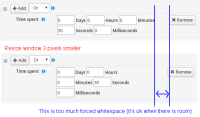
- Less whitespace

It's good that the Remove button is aligned right, so any remaining space gets filled by whitespace.
But when the browser window is gradually resized and becomes smaller, then the layout jumps too soon from 1 to 2 lines and from 2 to 3 lines.
The blue part of that images is a large piece of forced whitespace, which is an issue when there is not plenty of remaining space.
- Put "Use default phases: ..." before the add button,
because when you have configurated something explicitly, it's also before the add button.

- "Best score feasible" termination tooltip says "Terminates when a certain score is feasible". What's "a certain score"? Change to "Terminates as a soon as a feasible solution has been discovered." PS: if you copied this from the optaplanner-core docs, we need to fix it there too


