-
Story
-
Resolution: Unresolved
-
Undefined
-
None
-
False
-
False
-
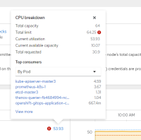
The CPU/Memory breakdown popovers that appear in a Node Details page currently show the top pod/project consumers by active utilization, and that's it.
When a node is over-committed (the total limits of all pods on the node exceed the node's capacity) the "top consumers" area of the popover doesn't help users see which pods/projects are contributing the most to that. The "top consumers" label may actually confuse users into thinking it's showing "pods with the highest total resource limit" when it isn't.
Ideally the popover would allow users to switch from seeing the top active utilizers to the pods/projects with the highest total resource limits and the highest total resource requests. Even more ideally, it might auto-switch to show the top contributors of whichever metric is outta whack right off the bat.


