-
Epic
-
Resolution: Done
-
Normal
-
None
-
None
-
Update the empty state for Topology
-
False
-
False
-
To Do
-
0
-
0% To Do, 0% In Progress, 100% Done
-
Undefined
-
S
-
GA
Problem:
When we initially designed Topology, we made the empty state be the Add page. The reasoning for this was two fold
- Users weren't able to add/create anything directly from topology
- Showing the Add Page provided discoverability for what we supported
Goal:
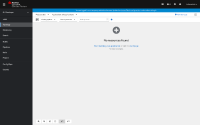
Topology empty state should NOT be the add page. We should display the canvas & provide an "empty state" with the text "Start building your application or visit the Add page for more details.".
Why is it important?
Why is this high priority? We are featuring the Drag & Drop a jar into topology at the Summit Demo. There's no way to accomplish this in an empty project because of the current empty state.
Acceptance criteria:
- As a user entering the Topology view, if my project does not have any existing workloads, I should see the Topology view with some empty state text (rather than the Add page). "Start building your application using the Quick Add feature or go to the Add page"
- As a user entering the Topology view, if my project does not have any existing workloads, I should be able to start with drag & drop of a fat jar immediately.
UX Design Artifacts
In both the graphical and list view, use the PF Empty State pattern & disable all topology toolbar items other than the Quick Search component.
- Empty state title: "No resources found"
- Empty state text: "Start building your application or visit the Add page for more details.".
- Clicking Start building your application should open the quick add
- Clicking Add page should navigate to the Add page
In the graphical view, the background will remain grey. In the list view, the background will remain white.
The following mock shows the empty state ( Note that the items in this mock are not properly disabled as they should be)

- relates to
-
ODC-5684 Cypress Automation - Topology scripts
-
- Closed
-
- links to
