Uploaded image for project: 'OpenShift Dev Console'
  1. OpenShift Dev Console
  2. ODC-5490

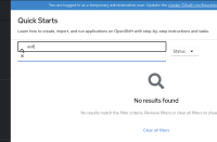
Quickstart search field clear button looks strange

XMLWordPrintable

    • False
    • False
    • 0
    • Undefined
    • Not Supported
    • Low

      Description of problem:

      When writing some text into the quickstart search input field, it shows clear button on the left hand side close to the search icon. Because both are shown this looks really strange.

      Prerequisites (if any, like setup, operators/versions):

      Steps to Reproduce

      1. Open the quickstart and enter something to the search

      Actual results:

      UI looks broken

      Expected results:

      UI looks good

      Reproducibility (Always/Intermittent/Only Once):

      Always
      Build Details:

      Additional info:

              Unassigned Unassigned
              cjerolim Christoph Jerolimov
              Gajanan More Gajanan More (Inactive)
              Votes:
              0 Vote for this issue
              Watchers:
              1 Start watching this issue

                Created:
                Updated:
                Resolved: