-
Bug
-
Resolution: Done
-
Normal
-
openshift-4.7
-
False
-
False
-
Undefined
-
Not Supported
-
ODC Sprint 196
-
Low
Description of problem:
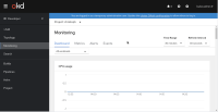
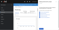
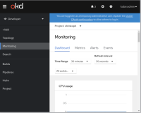
When open the monitoring page with an open quickstart panel on the right hand side, the time options "Time Range" and "Refresh Interval" overlaps the tab navigation items "Dashboard", "Metrics", "Alerts" and "Events".
When closing the quickstart panel and resize the window to a size similar to to the previous content size with quickstarts, some viewport breakpoints will change the layout before these buttons overlap. (There is a minimal overlap, see attached gif.)
Prerequisites (if any, like setup, operators/versions):
- A cluster with monitoring enabled (=no CRC)
Steps to Reproduce
- Use a browser window width of 1024 or 1200 pixel to validate this issue
- Open the developer perspective
- Open a Quickstart (help menu in the top right corner)
- Open "Monitoring" from the navigation
Actual results:
- Time options overlaps the tab navigation (see attached screenshots and gifs)
Expected results:
- Time options does not overlap the tab navigation
Reproducibility (Always/Intermittent/Only Once):
Always
Build Details:
4.7.0-0.nightly-2020-12-18-031435
tested with console 4.7 master (commit 91faa4662c8da8090119dd7207e6c1b282c066f1)
Additional info:
None


