-
Bug
-
Resolution: Done
-
Normal
-
4.12.0, 4.11.z, 4.10.z
-
Quality / Stability / Reliability
-
False
-
-
None
-
Moderate
-
None
-
None
-
Rejected
-
ODC Sprint 228
-
1
-
None
-
None
-
None
-
None
-
None
-
None
-
None
This is a manual clone of https://bugzilla.redhat.com/show_bug.cgi?id=2093597 to backport this to 4.10.
Description of problem:
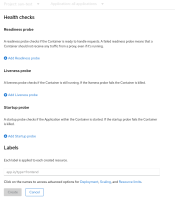
When importing a component from git or from a container image, and open one or more advanced options, the sentence "Click on the names to access advanced options for ..." is splited into two parts. And the headlines have no padding and everything looks squashed.
Version-Release number of selected component (if applicable):
4.10+
How reproducible:
Always
Steps to Reproduce:
1. Switch to dev perspective
2. Navigate to the add page > Import from container
3. Scroll down and open one or more of the advanced options
Actual results:
1. The sentence "Click on the names to access advanced options for ..." is shown before the opened option. The other available options are shown below the selected option.
2. The headline is displayed directly below "Click on the names to access advanced options for"
3. Another section is also shown directly under the first one.
Expected results:
1. The sentence "Click on the names to access advanced options for ..." and the options should be "one sentence" again.
2+3. Some padding for the header and/or between the sections, similar to 4.9. It must not look exactly as in 4.9, but there should be some padding between independent sections.
Additional info:
none
- clones
-
OCPBUGS-2780 Import: Advanced option sentence is splited into two parts and headlines has no padding
-
- Closed
-
- depends on
-
OCPBUGS-2780 Import: Advanced option sentence is splited into two parts and headlines has no padding
-
- Closed
-
- links to
