Uploaded image for project: 'OCMUI - OpenShift Cluster Manager UI'
  1. OCMUI - OpenShift Cluster Manager UI
  2. OCMUI-826

[OCM] Do not provide the blank input box if it is not required

    • Icon: Story Story
    • Resolution: Obsolete
    • Icon: Minor Minor
    • None
    • None
    • None
    • True
    • Hide

      This needs some more discussions and PM reviews for both of the design options.

      Show
      This needs some more discussions and PM reviews for both of the design options.
    • False

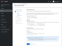
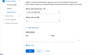
      On UI, currently when adding a key-value attribute, eg. 'Edit node labels', it always shows a couple of blank key/value input boxes as default. This gives a hint that the user may need to do something on this, however, they are not the requirement fields. From the user experience and the learning from EKS, as a customer, I'd like it does not show the blank input boxes, but only provide the button to allow the user to customize.

        1. eks.png
          eks.png
          34 kB
        2. ocm.png
          ocm.png
          169 kB
        3. 15.1 copy.png
          15.1 copy.png
          159 kB
        4. screenshot-1.png
          screenshot-1.png
          251 kB

              Unassigned Unassigned
              wavellite Yan Ming Sun
              Votes:
              0 Vote for this issue
              Watchers:
              6 Start watching this issue

                Created:
                Updated:
                Resolved: