-
Bug
-
Resolution: Done
-
Normal
-
None
-
None
-
None
-
None
-
False
-
-
False
-
-
Description of problem:
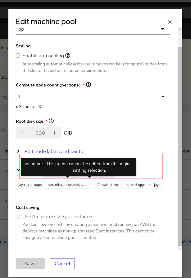
The tool tip texts related to security group names and disabled reason text are overlapped from "Edit machine pool" dialog for ROSA cluster.
See the inline screenshot.

How reproducible:
always
Steps to Reproduce:
- Open OCM UI staging.
- Open a Ready ROSA cluster installed with custom VPC(VPC should have some Security groups associated).
- Go to Machine pool tab.
- Click "Edit" context menu for machine pool( make sure it has some security groups associated)
- Mouse over on already configured Security groups.
- See the behavior.
Actual results:
On Step 5, Tool tip texts i.e. related to disabled options and security groups overlapped as mentioned above screenshot.
Expected results:
Do not overlap the tool tip texts and present it in better way so that user experience will be improved.
