-
Bug
-
Resolution: Obsolete
-
 Minor
Minor
-
None
-
None
-
False
-
-
False
-
-
-
OCMUI Core Sprint 277
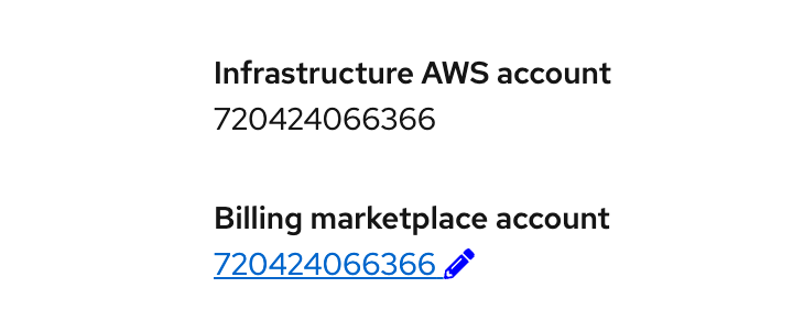
The link to edit the Billing account inside the cluster details overview of HCP clusters includes a pencil icon with the wrong blue (see screenshot attached). It looks like the default html blue color was used, which is not the PF one for links.
Also the Icon was manually added inside the Button content. We should't do that. We can follow PF docs example for inline button with an icon.
How to reproduce
- Open a ROSA HCP cluster detail page
- Scroll down until you see the Billing marketplace account link
- The link has two different colors for the account number and the pencil
Acceptance criteria
The link including its icon uses the PF blue color for links. Also the icon is not manually added inside the button text but it's properly passed as prop (see PF docs)
- is cloned by
-
OCMUI-3762 Change edit/modify button/links on Cluster overview
-

- Closed
-
