-
Bug
-
Resolution: Done
-
 Normal
-
None
-
None
-
Quality / Stability / Reliability
-
False
-
-
False
-
-
-
OCMUI Core Sprint 269
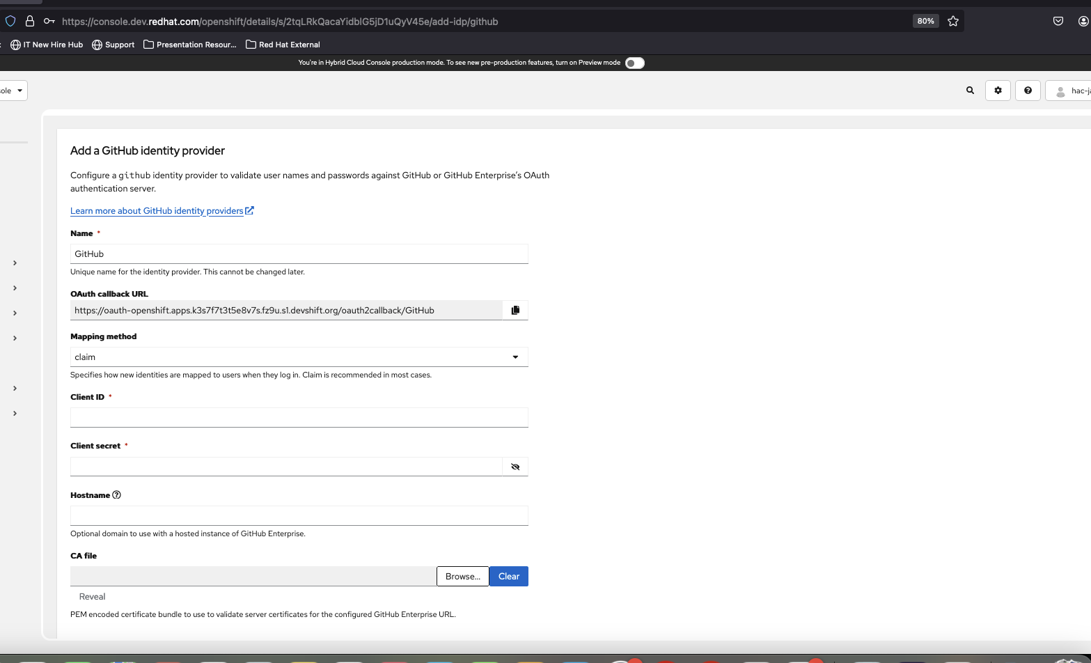
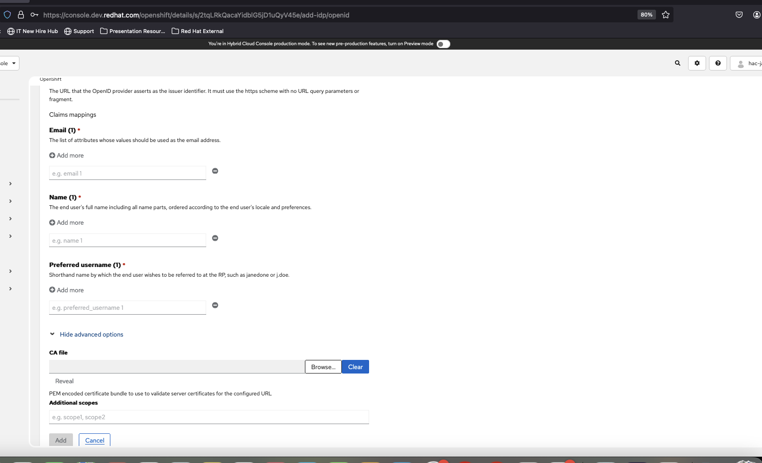
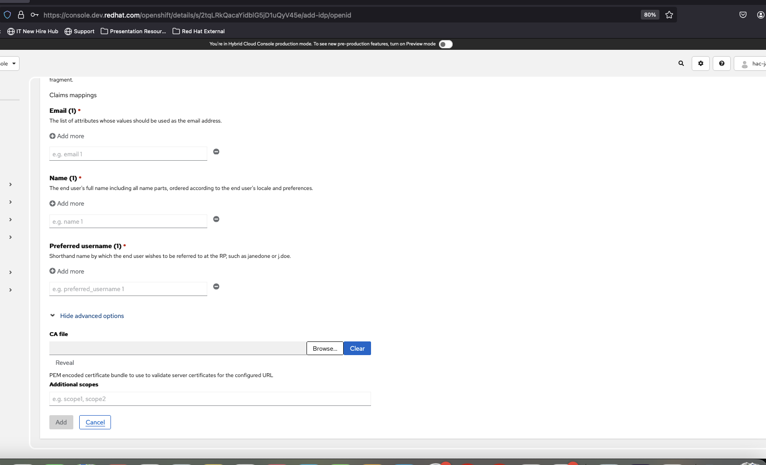
Description of problem:
In various IDP forms in OCM UI, the "Browser" and "Cancel" buttons for file upload section seems like overlapped or attached. It create a bad visual experience and UX. Probably a white space between each buttons would make better visual experience.
The same issue had reported https://issues.redhat.com/browse/OCMUI-2164 and fixed earlier but happening again. Probably related to the new PF6 updated?
How reproducible:
always
Steps to Reproduce:
- Open OCM UI staging
- Open a ready OSD/ROSA cluster.
- Go to "Access control" tab > Identity provider section
- Select "GitLab" IDP (or OpenID, LDAP etc)
- See the "CA file" field and button definitions.
Actual results:
Look and feel of "Browse" and "Cancel" button seems like overlapped in the IDP forms (ex: Gitlab IDP section)
Expected results:
Improve the visual experience of these buttons by including white space to separate each other.
- clones
-
-
- Closed
-