-
Bug
-
Resolution: Done
-
Major
-
None
-
None
-
None
-
Quality / Stability / Reliability
-
False
-
-
False
-
-
Steps to Reproduce:
1) Launch staging environment
2) Provide the default values and successfully create any OSD/ROSA cluster by providing default values.
3) Once the user submits the cluster details successfully, the user lands on the overview page.
4) A progress stepper is displayed on the overview page showing the installation progress.
Expected Result:
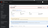
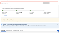
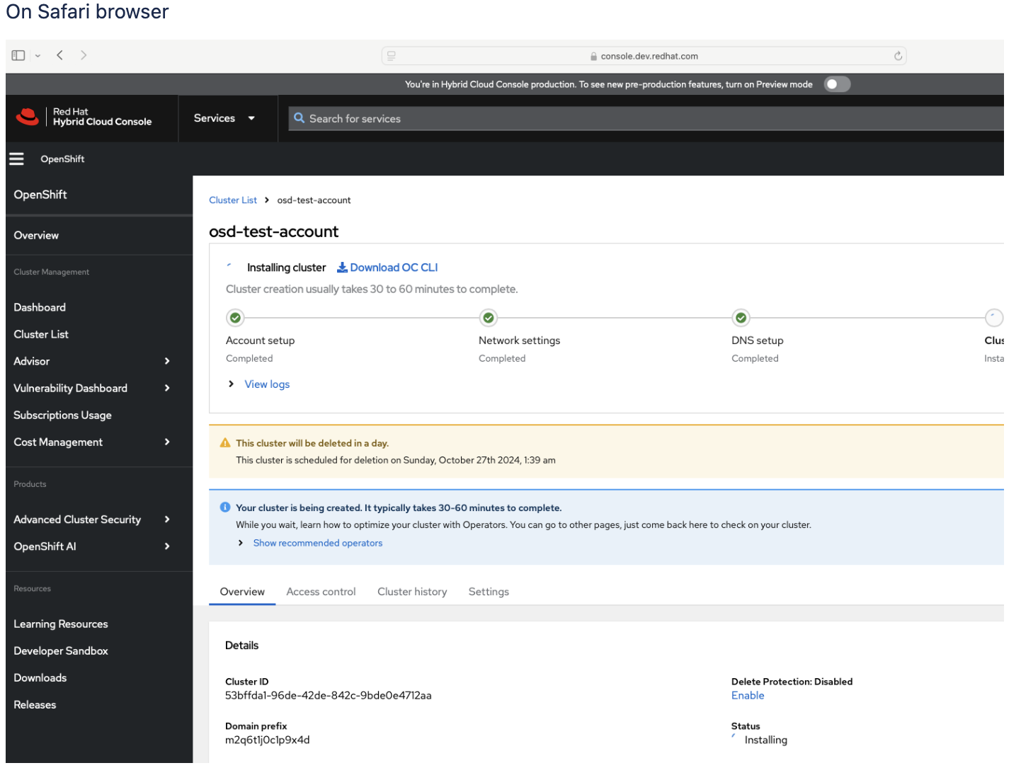
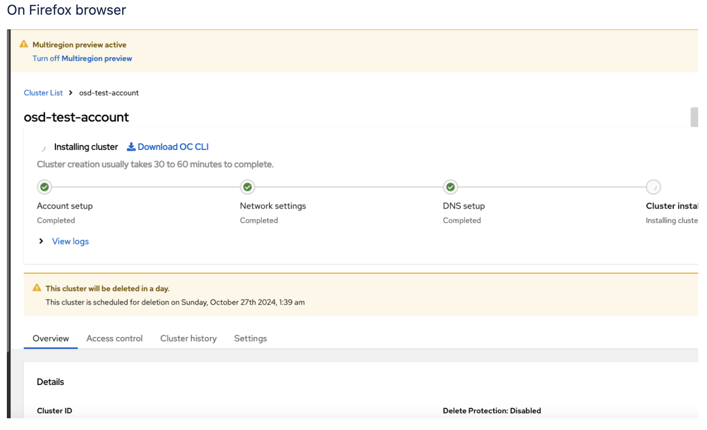
Notice the layout of the progress stepper. There should be a border around the progress stepper.
Actual Result:
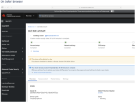
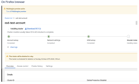
The border is displayed on various browsers differently.
Eventhough it is a cosmetic issue, it does not leave a good user experience as it affects the look and feel of the page. Therefore, this issue should be considered as a priority.
For example, on the Safari browser, the user can notice the border but the open console and actions button seem to hide the border.

However, on the firefox browser the border is invisible
- relates to
-
OCMUI-2217 [Cluster Details] Move ClusterProgressCard to the top of the page
-
- Closed
-

