Uploaded image for project: 'OCMUI - OpenShift Cluster Manager UI'
  1. OCMUI - OpenShift Cluster Manager UI
  2. OCMUI-2510

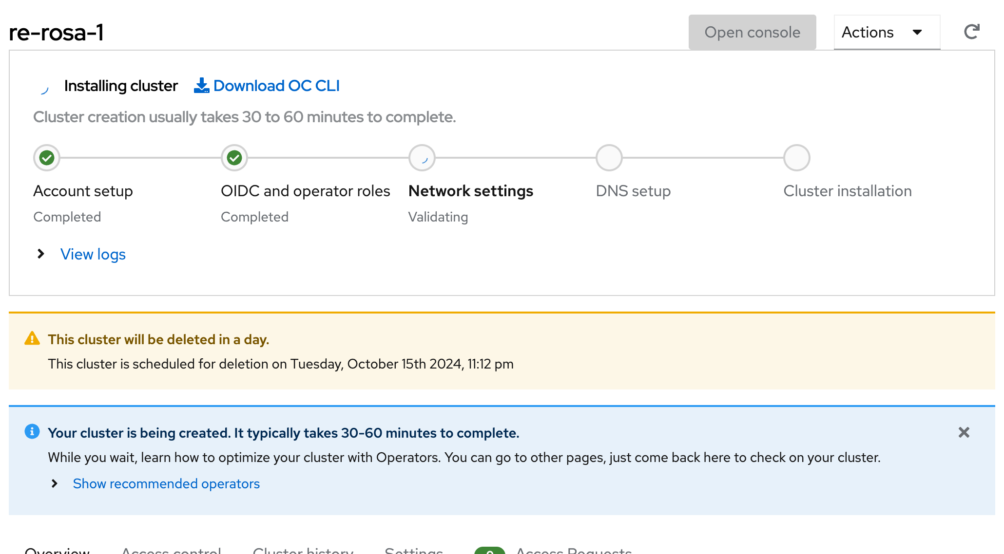
Missing spacing between cluster title and installation progress box

    • Icon: Bug Bug
    • Resolution: Done
    • Icon: Major Major
    • None
    • None
    • None
    • False
    • Hide

      None

      Show
      None
    • False
    • OCMUI Core Sprint 261, OCMUI Core Sprint 262

      The cluster title area and the installation progress card are too close. There should be spacing between them, coherently with the rest of the layout.
       

              rh-ee-lufreita Lucas Freitas
              robertoemanuel Roberto Emanuel
              Jayakrishnan Mekkattillam Jayakrishnan Mekkattillam
              Votes:
              0 Vote for this issue
              Watchers:
              4 Start watching this issue

                Created:
                Updated:
                Resolved: