-
Bug
-
Resolution: Done
-
Normal
-
None
-
None
-
None
-
False
-
-
False
-
-
-
OCMUI Core Sprint 261, OCMUI Core Sprint 262
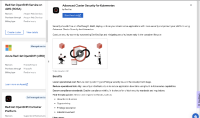
When opening the Drawer and dragging it towards the left side of the page, there is white space between the icon of the Drawer and the title.
Also, the icon on the drawer looks a bit small, we should make it larger
We could consult with UX to come up with an appropriate solution for this

