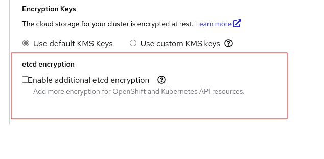
Description of the problem:
In a ROSA wizard, Under cluster settings > Details > etcd encryption section , it was found that the checkbox and labels are overlapped and makes bad UX behavior.
Steps to reproduce:
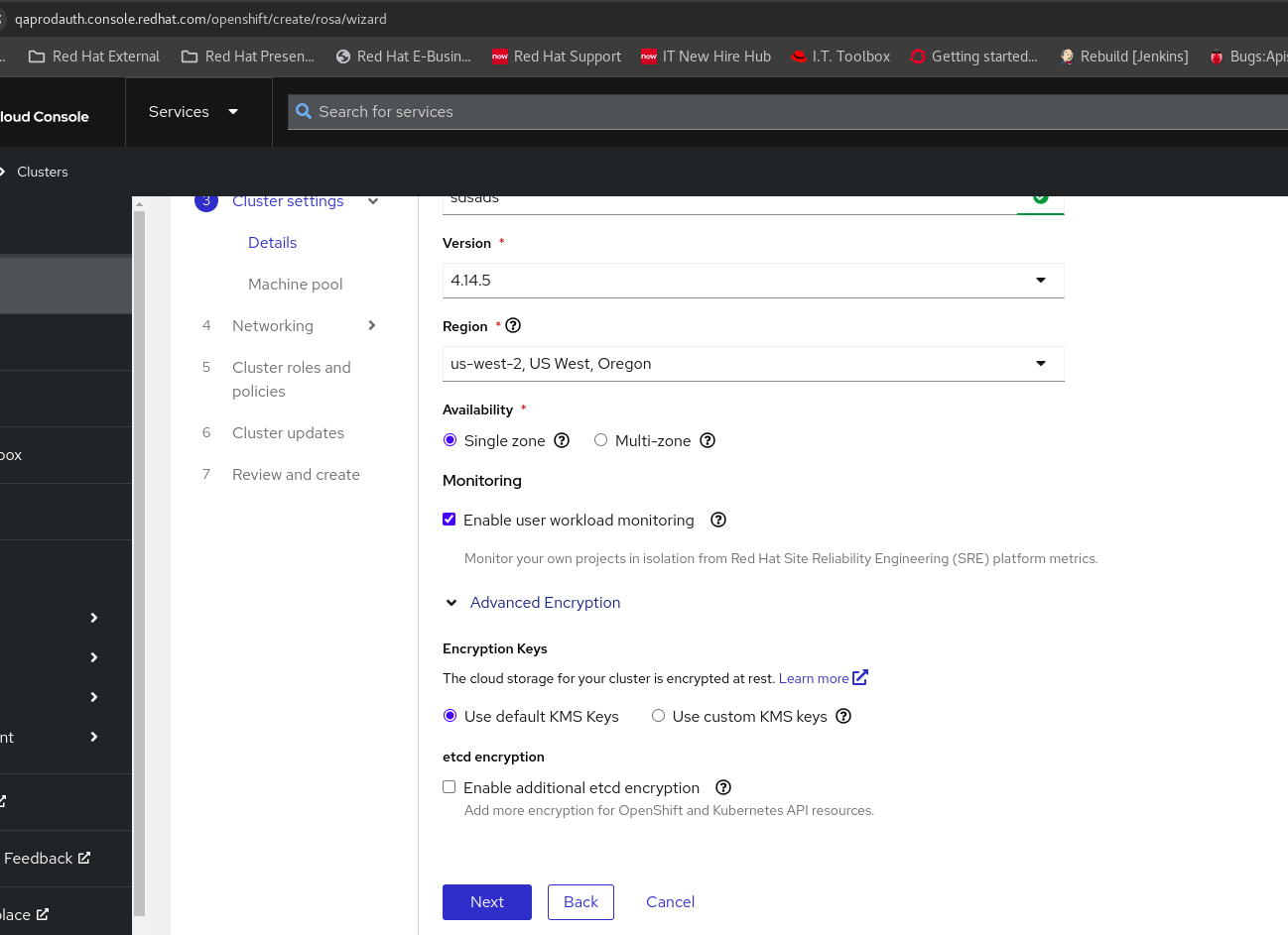
- Launch OCM Staging UI.
- Open ROSA wizard.
- Reach to "Cluster settings" > Details page.
- See the widget under etcd encryption section
Actual results:
Both checkbox and labels are overlapped and makes bad UX behavior as mentioned above.
Expected results:
Fix the with appropriate white space between checkbox and labels so that it eliminate current bad UX behavior
This was happening across all the browsers and tested with chrome, edge and firefox.
- blocks
-
OCMUI-513 PatternFly 5 Adoption
-

- Closed
-
- mentioned on