Uploaded image for project: 'OCMUI - OpenShift Cluster Manager UI'
  1. OCMUI - OpenShift Cluster Manager UI
  2. OCMUI-1006

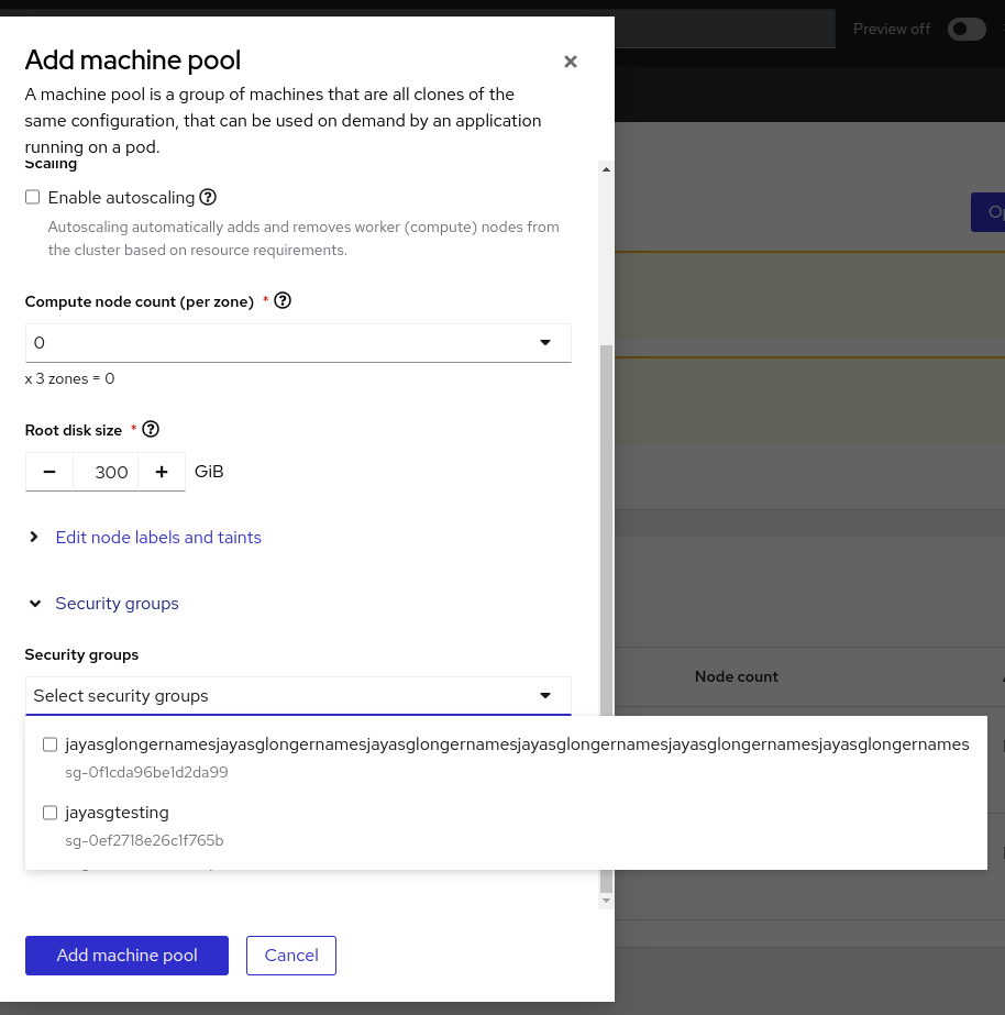
[OCM UI][ROSA]Wrong alignment of security group drop-down in case of larger security group names

    • Icon: Bug Bug
    • Resolution: Done
    • Icon: Major Major
    • None
    • None
    • None

      Description of problem:

      In case of larger security group names , the alignment of security groups drop-down in Add machine pool dialog seems wrong
      How reproducible:

      always

      Steps to Reproduce:

      1. Open OCM UI staging.
      2. Open a Ready ROSA cluster  installed with custom VPC(VPC should have some Security groups associated with larger names).
      3. Go to Machine pool tab.
      4. Click "Add machine pool" button
      5. Click "Security groups" drop-down and See the behavior.

      Actual results:

      The security group drop-down fields seems misaligned when larger SG names present.

      Expected results:

      Show the security group drop-down fields properly with a fit to parent dialog when larger SGs present.


        1. image-2023-11-10-16-40-59-110.png
          83 kB
          Jayakrishnan Mekkattillam
        2. image-2023-11-24-13-13-58-143.png
          123 kB
          Jayakrishnan Mekkattillam

              rh-ee-camadorg Celia Amador Gonzalez
              jmekkatt@redhat.com Jayakrishnan Mekkattillam
              Jayakrishnan Mekkattillam Jayakrishnan Mekkattillam
              Votes:
              0 Vote for this issue
              Watchers:
              4 Start watching this issue

                Created:
                Updated:
                Resolved: