-
Enhancement
-
Resolution: Done
-
Blocker
-
4.0.0.Alpha4, 3.8.1.Final, 3.8.x-prod-ip6.1
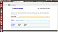
The "Save" button currently in the upper-right corner near the login/logout buttons should be moved closer to where the content and edit buttons are. And it'd be ideal for the save button to be enabled only when there's something to save.
