-
Bug
-
Resolution: Unresolved
-
Major
-
None
-
Kogito Tooling 0.27.0
-
False
-
-
False
-
---
-
---
-
-
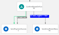
The connection label shows two rows instead of one when hovering over the label also in cases that it doesn't make sense. There is also redundant blue box area shown around the text.
- See monitor-job.sw.json
 , reusing-function-and-event-definitions.sw.json
 from specification:


- See also handle-frontend.sw.json, handle-backend.sw.json from kogito-examples
It might look good showing the text in two rows in some cases. However, the redundant box should be removed and the text should be split "symmetrically" instead of just letting a few characters in the new row. In addition, it should be split only in case there is not enough space (space from UX point of view).
Acceptance criteria
Showing labels on mouse hover is unified across the diagrams.
The redundant blue box area around the label is:
- either removed completely
- or unified across the diagram and text is centered inside the area.
The text is split in to more rows under the following circumstances: TBD
- is caused by
-
KOGITO-8445 SWF Diagram Viewer - Orthogonal lines
-
- Resolved
-
- is related to
-
KOGITO-8346 SWF Editor - Displaying the string on hover over label is not formatted properly
-
- Open
-
-
KOGITO-8683 SWF Viewer - Orthogonal lines improvements
-
- Open
-