-
Task
-
Resolution: Done
-
Major
-
None
-
False
-
-
False
-
---
-
---
-
2022 Week 26-28 (from Jun 27), 2022 Week 29-31 (from Jul 18)
Motivation
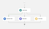
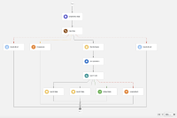
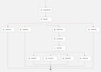
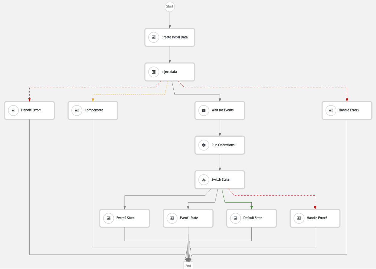
Actually when a workflow is being opened, it fits into screen size by default, and depending on the number of states, it may result on states being really small, where user can't easily differentiate between types, as icons are also so small. For example:
Goal
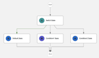
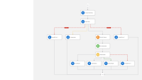
The goal is to improve workflow's high level view and readability, by adding colors to states, depending on the state type.
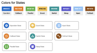
Colors and it's appearance (thickness, size, alignment) should as it shown on the image below:
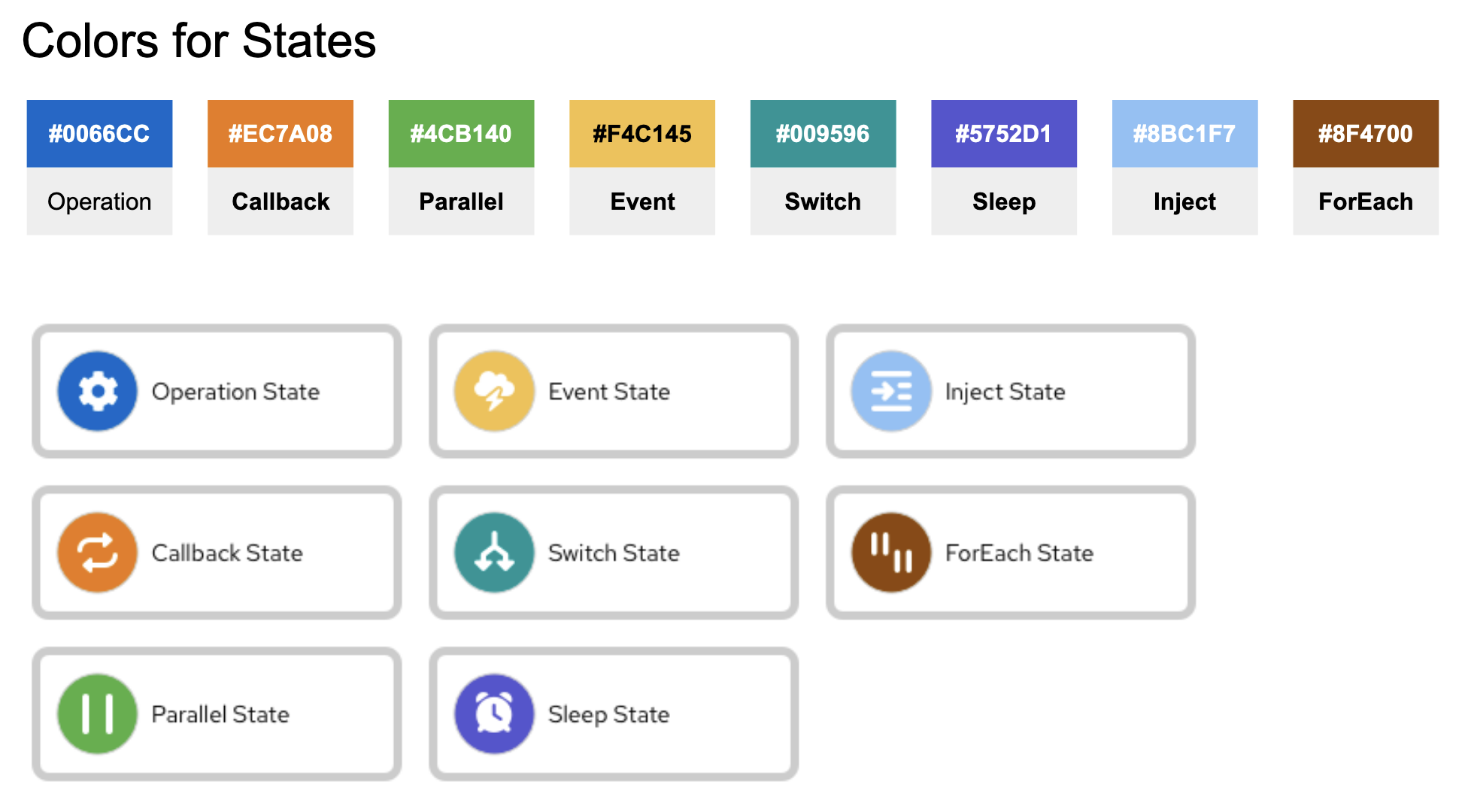
Colors by State:
- Operation State = #0066CC
- Callback State = #EC7A08
- Parallel State = #4CB140
- Event State = #F4C145
- Switch State = #009596
- Sleep State = #5752D1
- Inject State = #8BC1F7
- ForEach State = #8F4700
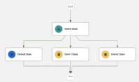
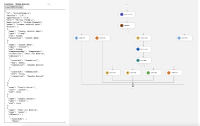
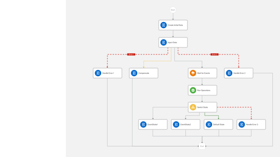
Here is some example of the resulting workflow:
Not a goal
Update icons to new one. This issue is solely about icons appearance and it's background, not icons themselves.
Actions
- Perform changes in the states shapes in order to apply colors, thickness, size, alignment
- is related to
-
KOGITO-7603 SWF Editor - change icon of Event State
-
- Closed
-

